PERSONAL PROJECTS: PORTRAIT & IDENTITY // CONCEAL & REVEAL
INITIAL IDEAS & THOUGHTS
'When you photograph a face... you photograph the soul behind it.' |
'I am made and remade continually. Different people draw different words from me.' |
'We reveal our joys and successes, we conceal our pain.' |
Why did I choose these quotes?
To me the first quote not only sums up portraiture but photography as a whole, an image isn't just an object or person, but someone's or something's personality and purpose. The second quote proves different interpretations of people's identity and how an image can portray different aspects of people's emotions. Thirdly, I feel the third quote doesn't just link to life as a whole but this is shown through photographs too. Sometimes in a photograph you take it several times to reveal the best of yourself and hide you real emotions behind the image (conceal and reveal), which is what this quote says. To me these quotes are extremely inspiring due to their sense of the truth not told often.
Portrait Photography Definition: Portrait photography, or portraiture, is a type of photography aimed toward capturing the personality of a person or group of people by using effective lighting, backdrops, and poses.


INITIAL RESEARCH - WORD MIND MAP & VIDEOS

|
|
INITIAL RESEARCH - PHOTOGRAPHIC TECHNIQUES
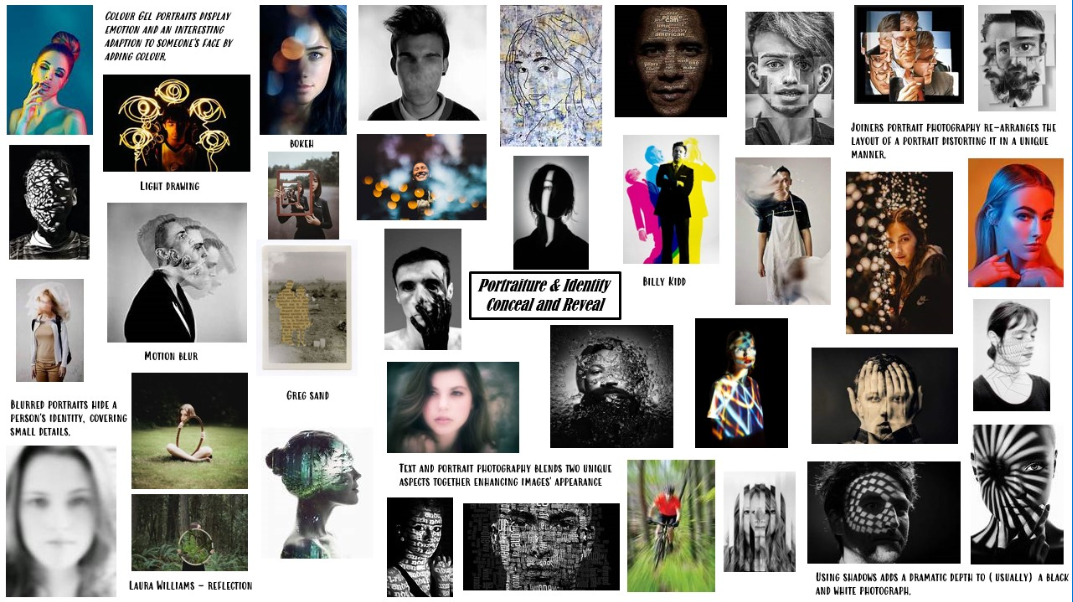
INITIAL RESEARCH - EXPERIMENTAL PORTRAIT PHOTOGRAPHERS

CONCEAL & REVEAL // LIGHT - LINDSAY ADLER


Why did I choose Lindsay Adler as my first photographer?
How does Lindsay Adler's work inspire me?
|
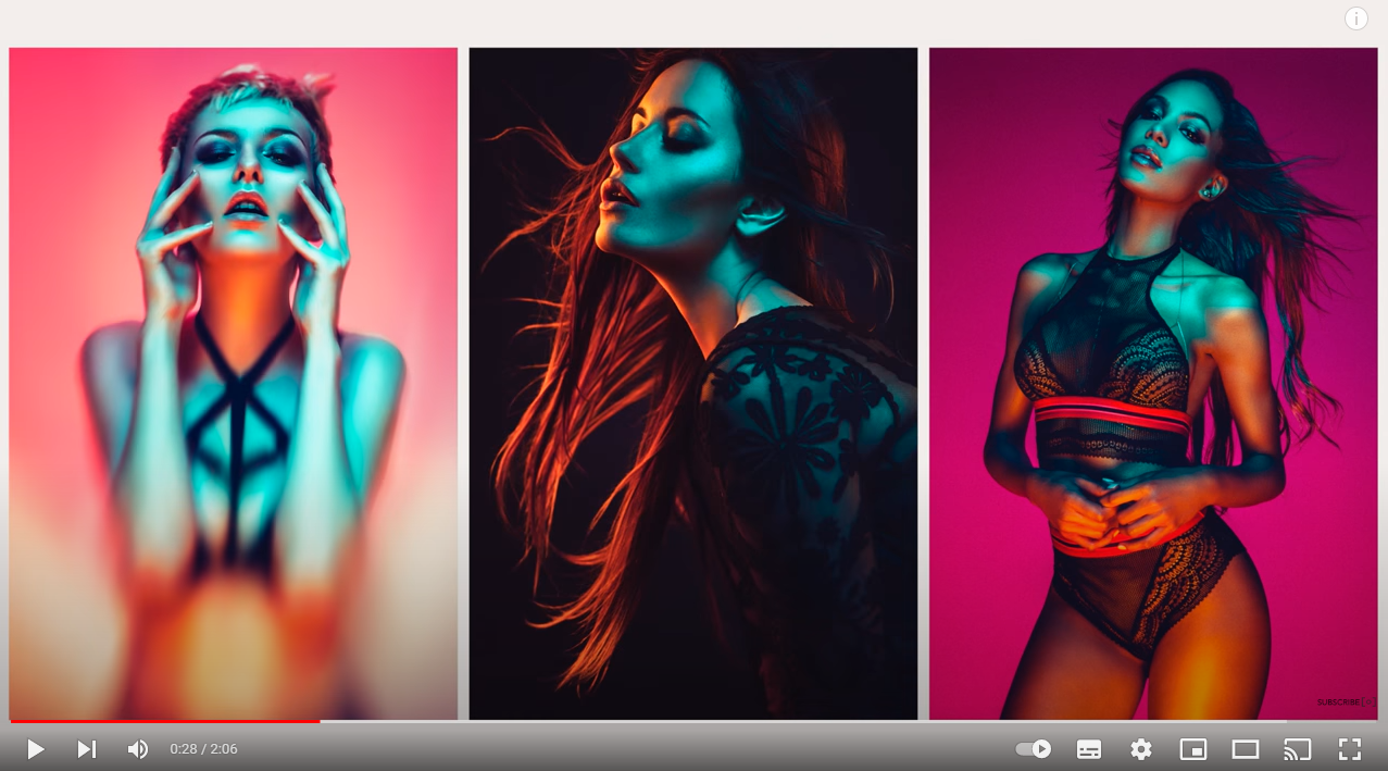
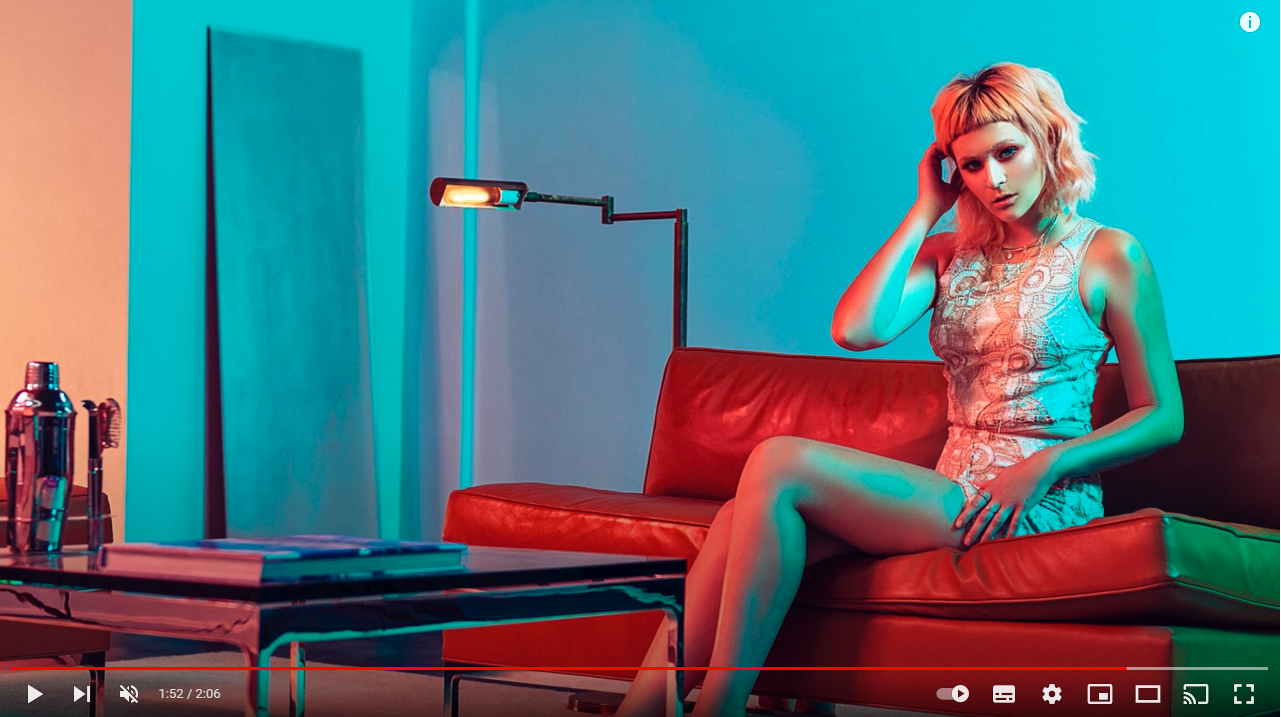
Lindsay Adler is an American portrait and fashion photographer based out of Manhattan, New York widely known for her experimentation of light through photography. This inspires me greatly due to her adventurous and creative personality, making her fond of learning new techniques and methods. Adler uses Colour Gels throughout her portfolio of 'Editorial Beauty' shown above and enhances images using harmonic colours and sometimes the simplicity of the monochromatic technique. Her work inspires me as it is extremely appealing and unique.
|
Using colours in this dramatic way inspires me due to the messages and emotions you can convey through one single photograph, for example purple illustrating power and royalty. On the other hand Lindsay Adler uses colour through her work simply to fit with the brand she is working with or what she is photographing.
'Photography is my greatest passion in life. As an educator I believe that we should never stop learning and that is especially important for photographers to continue to grow, push the boundaries and learn new techniques.' - Lindsay Adler
|
How does this link with our topic?
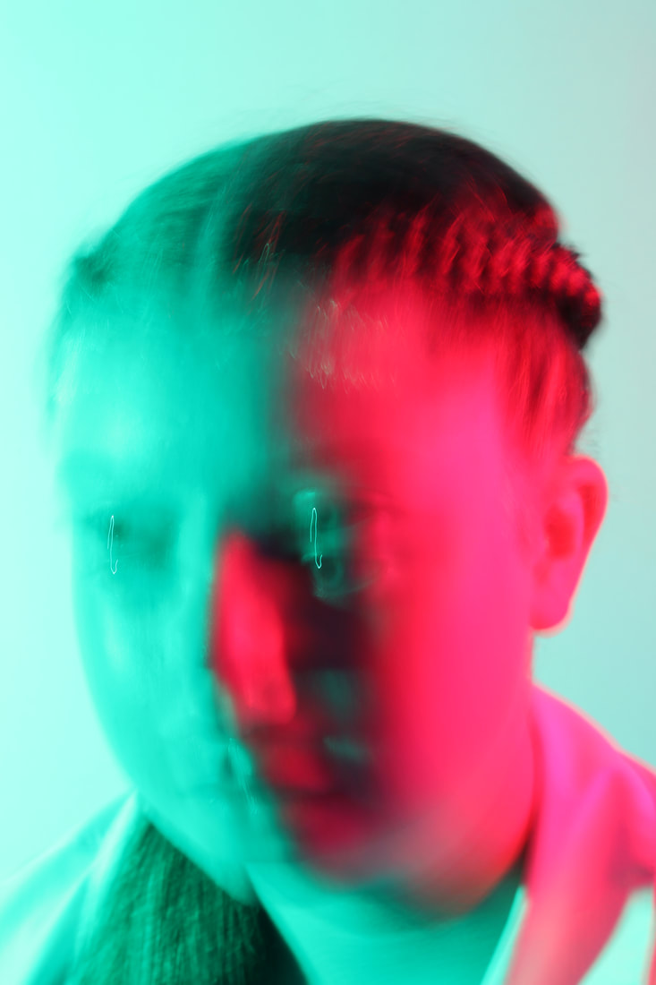
Lindsay Adler is a perfect photographer to research for this topic of 'Portraiture and Identity, Conceal and Reveal' not only because her work in this portfolio ' Editorial Beauty' is portraiture but because she portrays each keyword in this topic perfectly. For example identity has been used through each and every photograph shown above due to them all illustrating different unique and individual personalities. Although identity is significant throughout her work Lindsay Adler conveys a prominent message of conceal and reveal. Displayed earlier by a quote by Jesse Jackson, Conceal and Reveal is showing your successes and hiding your pain and weaknesses. I think Adler's work is an inspiring example of this message, as when we take photographs it takes several tries to get what you want your viewers and audience to see. For example this photograph shown is a definition of this, someone scared to show who they really are through an image, concealing their identity. This is proven through how Adler has positioned the model (half of the face covered) and the lighting used. |

|
Why does this technique appeal to me?
The technique of Colour Gels truly appeals to me especially through Lindsey Adler's work. Personally, I think the use of Colour Gels in portraiture is a good way to add vibrancy and another level of creativity to a photograph, which can additionally communicate a range of moods to the viewer. Using this technique draws significant attention to an image if you were to walk by and makes your photograph memorable to the public. Not only does this add vibrancy and colour, but it draws the viewer's eyes and attention to the reasoning behind the colours chosen and the meaning to why they have been included.
The technique of Colour Gels truly appeals to me especially through Lindsey Adler's work. Personally, I think the use of Colour Gels in portraiture is a good way to add vibrancy and another level of creativity to a photograph, which can additionally communicate a range of moods to the viewer. Using this technique draws significant attention to an image if you were to walk by and makes your photograph memorable to the public. Not only does this add vibrancy and colour, but it draws the viewer's eyes and attention to the reasoning behind the colours chosen and the meaning to why they have been included.
Processes and Techniques of Lindsay Adler's work
|
In Lindsay Adler's portfolio of 'Editorial Beauty' shown above, the techniques and processes used are Colour Gels. She creates this effect by using different lights and Gels, which are pointed in different directions, on the face. Adler uses grids in her work which focuses the light and makes sure less light reaches the background, overall trying to limit the spread of light. This video is an amazing tutorial of how she photographed and edited the image shown.
|
|

|
How could I emulate Lindsay Adler's work?
To emulate Lindsay Adler's Colour Gel technique I would use coloured wax paper. I would then simply wrap this around an LED light and project this on my subject. For the background of the photograph I would most likely keep it plain and simple so all the attention is on the person and Colour Gels. After I had done this I would position the model for the photograph and adjust the settings on my camera depending on the lighting of the room eg. how much light is let through windows. After this I would most likely use PIXLR to edit my image, where I could change the background colour, hue and saturation etc. |
Lindsay Adler's Website - https://lindsayadlerphotography.com/
CONCEAL & REVEAL // LIGHT - BRANDON WOELFEL


Why did I choose Brandon Woelfel?
How does Brandon Woelfel's work inspire me?
How does Brandon Woelfel's work inspire me?
|
Brandon Woelfel is a photographer based in New York who, in this case, experiments with the use of light through Bokeh photography. His work inspires me due to how appealing and colourful it is, making each and every photo magical. Using this style of photography enhances the small details of light and expands them to make it the subject of the image. I find his work an inspiration due to the emotions and personalities brought through a photograph and the colours he uses, making his work extremely memorable.
|

|
“If you’re gonna judge someone’s gear before you even see their photos, the door is right here.”
— Brandon Woelfel

|
How does this link with our topic?
Brandon Woelfel's work links perfectly to our topic of Portraiture & Identity, Conceal and Reveal especially as I am focusing on the topic of light at the moment. Woelfel portrays people's identity and emotions through light and colour which inspires me and due to this links well with our topic. Identity is clearly something Brandon Woelfel likes to experiment with and explore due to his passion not only through photography but through what he said in his quote above. I think using light in this way is really inspirational and I will consider using this technique through my work in the future of this topic. |
How and why does this technique appeal to me?
I find all of Brandon Woelfel's work using Bokeh photography extremely inspiring and creative. In photography light is the one thing every photographer has to focus on even if you aren't using light in this way. Due to this I think taking light to a further extent and experimenting with light through this method is extremely effective to improve a photo and the interest from the viewer or audience. Not only can this technique be used inside with fairy lights around the house, but you can use this outside with every day things like cars, signs and billboards, which is when your imagination can go wild. Overall I think this technique enables you to simply try new things in every place you go and make a boring place unusual, memorable and inspiring and you can use this technique wherever you go.
I find all of Brandon Woelfel's work using Bokeh photography extremely inspiring and creative. In photography light is the one thing every photographer has to focus on even if you aren't using light in this way. Due to this I think taking light to a further extent and experimenting with light through this method is extremely effective to improve a photo and the interest from the viewer or audience. Not only can this technique be used inside with fairy lights around the house, but you can use this outside with every day things like cars, signs and billboards, which is when your imagination can go wild. Overall I think this technique enables you to simply try new things in every place you go and make a boring place unusual, memorable and inspiring and you can use this technique wherever you go.
|
Processes and Techniques of Brandon Woelfel's work
Throughout Brandon Woelfel's work he uses Bokeh photography. To do this he photographs in many different places, for example, on a road, in his house and many more. To improve his photographs he uses many editing techniques and plays with the hue saturation and luminance layers to make photos brighter or darker. He also experiments with different props and objects for example, bubbles. Another technique he uses is creating overlays which he sometimes places behind an original photo to make it more exciting. |

|

|
How could I emulate his work at home?
At home I would begin with finding some source of light for example fairy lights etc. I would then choose my camera settings, in this cause I would want a wide aperture to get a shallow depth of field. I would then adjust my ISO and shutter speed to the photograph I want to take. Using the image shown I would want to have the model hold the fairy lights towards the camera to increase the Bokeh effect. After the shoot I would edit my photograph using PIXLR and I would adapt the hue and saturation using the adjustments tool. For this shoot I would most likely do it closer to night time so there is some light through the windows but it is still dark enough for the fairy lights to light up the subject. |
Lindsay Adler & Brandon Woelfel // LIGHT
|
Lindsay Adler and Brandon Woelfel are both photographers inspired by light in photography. Although they both focus their images on light, their different styles and methods of using light contrast.

- Brandon Woelfel
|

- Lindsay Adler
While Lindsay Adler uses Colour Gels and her photography is very detailed, Brandon Woelfel uses Bokeh photography which blurs the light and makes it a soft focus.
|
How could I combine these different styles of photography together?
One way to combine these two techniques of light photography is having fairy lights in the background of the photograph and making them soft focus. I could then introduce a model and direct different coloured lights using Colour Gels. Although this could be very effective, it could also be overpowering so I would consider the colours I choose to make the image simple and not hard to look at.
One way to combine these two techniques of light photography is having fairy lights in the background of the photograph and making them soft focus. I could then introduce a model and direct different coloured lights using Colour Gels. Although this could be very effective, it could also be overpowering so I would consider the colours I choose to make the image simple and not hard to look at.
SEMI Analysis // Lindsay Adler
|
1. The Photographer of this image is called Lindsay Adler and you can find the photograph shown here in her 'Editorial Beauty' portfolio in her website linked previously. The genre of this image is portraiture using Colour Gels, which Lindsay Adler is widely known for. To create this photograph Adler would have used Colour Gel lighting to adapt the portrait and will have used a tripod to keep her camera stable and prevent motion blur.
2. The subject of this image is the model being photographed, specifically her hair and eyes. Here the rule of thirds has been used to draw almost immediate attention to the model's eyes which compliment the colour gels on her hair. Due to the composition used the viewer's eyes are lead around the photograph, finding unique features of the subject at each glance. Lindsay Adler has taken this image at eye level, this emphasises certain features of the person and allows the photograph to mainly be of the face. In Lindsay Adler's work she employs a range of visual elements which make this image unique and striking. One of them, the most significant, is colour. Lindsay Adler explores this visual element by projecting a green colour gel on her hair which signifies this feature and gives a depth to the photograph. Not only is this element used on her hair but additionally is highlighted on her eyes. Purposefully, Lindsay Adler has projected a blue light on the whole face except the area of the eye. By doing this the viewer's attention is almost immediately drawn to this feature due to how well it compliments the Colour Gels used. Additionally a key visual element shown throughout this photograph is space. Adler has used this technique to emphasise the model from the rest of the image. Finally Adler uses form which, for many reasons, makes this photograph memorable and significant. 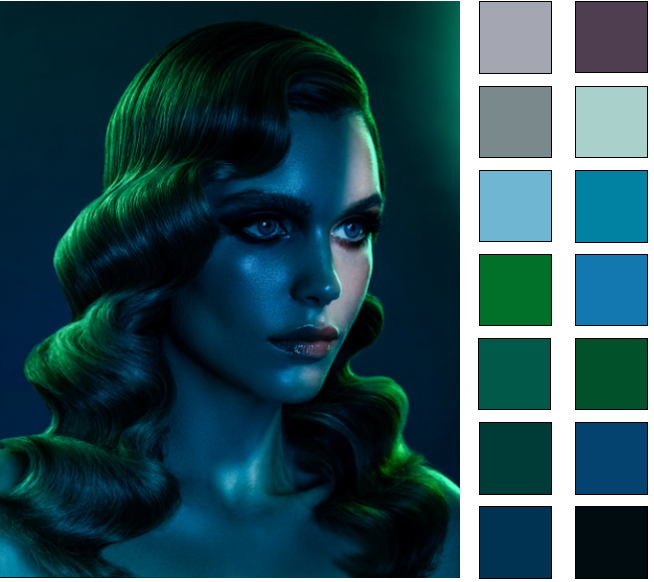
5. I feel the photograph coveys a message of innocence and makes you feel calm. It does this by doing many things. Firstly Adler has used highlights and shadows which makes the image darker and creates a relaxed mood. Additionally, Adler has kept the facial expressions of the model simple. By doing this she has made the model look submissive and nervous, while putting on a brave face. Finally Adler has only exposed part of the model's face to a white light. In my opinion this gives me the impression the model has hidden her identity from someone and is only just revealing a part of her personality.
|

3. To highlight this Adler has used dramatic lighting to emphasise the form of the model and her hair. Using this technique defines the model's facial features and adds highlights to the model's face. The hairstyle of the model also creates unique shapes which would appeal a viewer to the image.
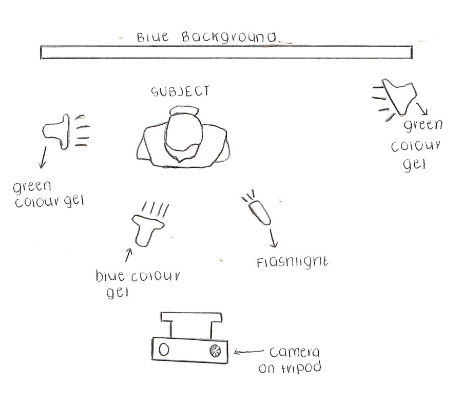
4. The photograph has been taken from a short distance, this means Adler is able to capture most of the model's face and remain the viewer's attention to the subject and not any other surrounding backgrounds or objects. Overall taking this image from a short distance prevents Adler from having to crop any parts of the image, additionally making the model the main focal point of the photograph. Adler has placed the model's hair in the foreground of the image. This highlights the Colour Gels used and also uses a lot of space in the photograph making this more appealing to look at. A green Colour Gel has been used at the top right of the photograph attracting the viewer's eyes to this part of the background, which then automatically leads you to the model's eyes. This image has clearly been taken in a studio setting using artificial lights and Colour Gels as this wouldn't be possible to take outside. Most likely this shoot has been taken in an enclosed room to prevent any natural sunlight from disturbing the lighting and photograph. In my opinion, I think the light sources have been placed in the layout of this diagram shown. By using these cool and calm colours Adler has created an atmosphere of serenity and innocence. Not only is this portrayed by the lighting and colours, but additionally the position of the model. To emulate this photograph I would use blue and green Colour Gels positioned similarly to the diagram shown. For this photograph I would most likely not have a wide aperture as most of the image is clearly focused, I would additionally use a slow shutter speed but I would experiment first to see what works best for the image and the colours used. To carry out this shoot I would definitely use a tripod to prevent motion blur and possibly use a shutter release cable to also stop movement while taking the photograph. Finally I would research some techniques Lindsay Adler uses in her Colour Gel work, for example the position of the model and direction of light.
6. This photograph links well to our project of 'Portraiture and Identity, Conceal and Reveal' due to the model revealing part of her face which links to identity and conceal and reveal. Not only do the feelings link well to our project, but Lindsay Adler has based this image around light and Colour Gels which links well to our study of light through portraiture. The strengths of this image are the composition and form of the image which really enhances the message portrayed throughout the photograph. But one way I would adapt this image is by adding some blue Colour Gels to her hair at the bottom right of the photograph, which in my opinion would contrast amazingly to the green on her hair. |


SEMI Analysis // Brandon Woelfel
|
1. The photographer of this image is Brandon Woelfel, who is well known for his unique Bokeh photography. The genre of this photograph is Bokeh portrait photography which links well to our theme of portraiture and light. In this picture there is most likely not a tripod being used as there is still cars on the road therefore the photoshoot would be extremely fast. In addition I can also see cars in the background which create a Bokeh effect. 2. The composition for this photograph positions the model in the centre and foreground drawing all attention to her. Not only is the positioning of the model determining the focal point, but the fact Brandon Woelfel has used the rule of thirds in this image too. Brandon Woelfel has taken the photograph from at eye level which allows the viewer to focus on the model's face and not her whole body. This perspective is effective as it enables the photographer to capture the optimum amount of lights because we are able to see them from eye level. Throughout his work Woelfel employs a range of visual elements which make this image more attractive. One of these is colour. Although this is an obvious element considered in almost every photograph, colour has a strong impact on this image especially, and could not be the same without it.
5. This creates an atmosphere of relaxation and settled due to the soft focus. To emulate this photograph myself I would go to a busy road near by with lots of different coloured lights. This would enable me to create Bokeh photography. I would adapt my camera settings while there as the lighting may change throughout my shoot if it starts to go dark. Although I could not give exact camera settings now I would need a wide aperture for a shallow depth of field. Additionally I would also need to research stability solutions and positioning of the model.
|

3. The colour projected from the traffic lights, cars and surroundings personifies the image and makes it unique to the viewer. Brandon Woelfel has contrasted these colours by including warm and cool, complimentary colours which makes the viewer feel alive and safe. Additionally texture is a striking element used in this photograph due to the emotions it portrays. Using Bokeh photography adapts the texture of light from a harsh, sharp and bold colour to a soft focus and fuzzy looking colour. Not only does this make the image easier to look at, but emits positive and relaxed energy.
4. The photo has been taken from a short distance to allow full focus on the model's face and a shallow depth of field for the background. Although this has been taken quite close I think Brandon Woelfel will have used a cropping tool to remove some areas. For example some more cars may have been included and some buildings to the left may have been removed. Additionally using the cropping tool will have been a great way to get the rule of thirds exactly. Overall this makes the model the main focal point of the image. The road in the middle ground of the photograph uses leading lines to guide the viewer to the main source of light above the model's head. By doing this the viewer's attention is immediately on the model but then drifts to the lights and cars surrounding her. This image has clearly been taken outside as you can see the road in the background. Additionally as it is night time, not much of the light will be from natural sunlight and most would be provided by the cars and street lamps. 6. I feel the lights in this photo convey a message of not only relaxation but to contrast excitement too due to the colours reminding you of Christmas. Overall this makes the viewer feel nostalgic. The model emits a feeling of confidence and power due to her stance in the road and the composition of the image. Not only does her positioning prove this but also the fact she is in the middle of the road which illustrates power and authority. Finally, this photograph links extremely well to our project of 'Portraiture and Identity, Conceal and Reveal' and additional study and focus of light due to this technique being widely used, popular but also so effective and unique.
|


Trip to UCLan / Photography and Animation Workshop

|
I visited UCLan recently on a photography and animation workshop where we were able to have a campus tour and a look at the degree show. While I was there we discussed the meaning behind some prom images during COVID-19 where no one was able to attend. This allowed us to really interpret emotion from photographs and relate to the pandemic. We soon created our own portraits on iPads with no
|
|
guidance and only the simple iPad editing software to adapt our images. My results are shown here. We then went on to make an animation using image backgrounds and plastic fruits to create a story of a normal day at University, soon looking at some animations the students at UCLan made.
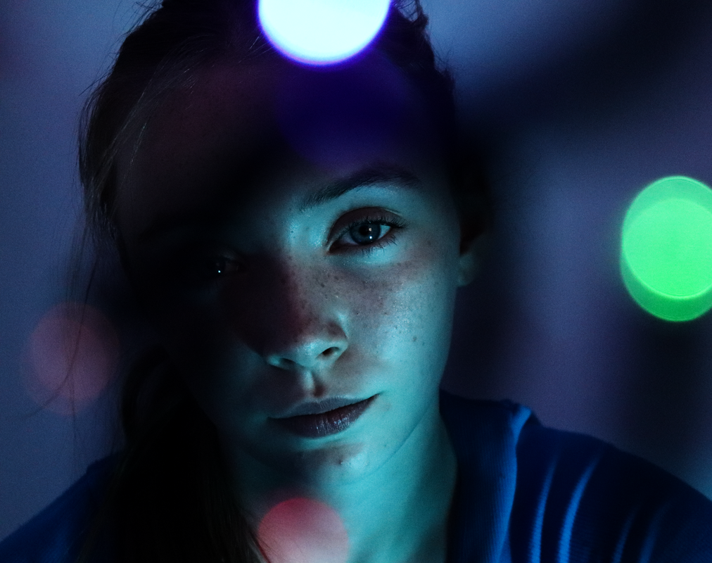
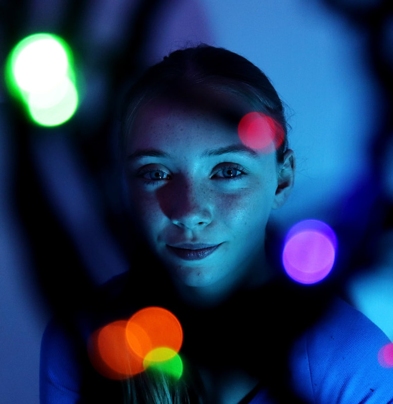
Experimenting with Light / Bokeh Workshop

After this you would introduce the fairy lights which will create this Bokeh effect. To make the image more unique you can wrap the lights around them model and make the patterns unusual to the eye.
|
Technique // Bokeh:
The definition of Bokeh photography is “the effect of a soft out-of-focus background that you get when shooting a subject, using a fast lens, at the widest aperture, such as f/2.8 or wider.” Simply put, bokeh is the pleasing or aesthetic quality of out-of-focus blur in a photograph. This can add extra depth to an image in the foreground, background or even both of them. How to re-create this technique: 1. To re-create this Bokeh photography technique you will first need to adapt your camera settings. For this particular shoot we used an f-stop of 1.4 and an ISO of 400. Additionally to improve this photoshoot you would use a tripod to stabilize your camera and prevent motion blur. You would then take a picture of just your model so the camera is aware of your main focus. |

|


|


Experimenting with Light // Bokeh Contact Sheet // Shoot 1 School

Shoot 1: 9 Experimental Images


Experimenting with Light // Bokeh Workshop / Editing Process

|
1. Crop Firstly to edit this image I cropped it to the size I wanted. This showed me the rule of thirds over the top of the image so I could adjust the photograph to the rule of thirds, making a clear focal point of the image which was the green Bokeh light. |
|
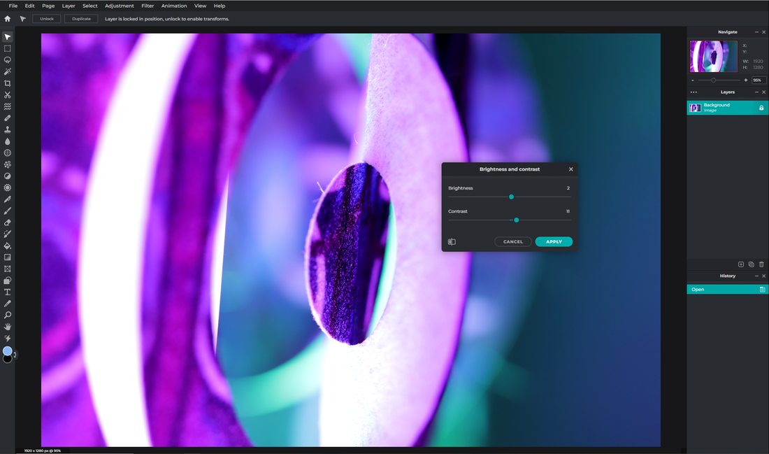
2. Brightness and Contrast Secondly I used the 'Brightness & Contrast' tool under the setting 'Adjustments' which allowed me to adapt the image. I decided the brightness was suitable at the level it was already at so I kept it at zero, but I decided to change the contrast so the bold colours stood out even more. |

|
|
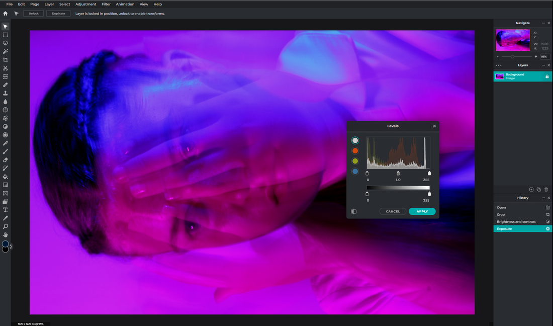
3. Exposure Thirdly I used the 'Exposure' tool once again under ' Adjustments' to change the photograph. This time I decided to decrease the exposure as it suited the image and I thought increased the broad contrast between the different grounds of the photo. |
|
4. Levels Fourthly I used the 'Levels' tool under 'Adjustments' which allowed me to change the darkness of the image. Although this time I kept this setting the same as I did not like how dull the photograph looked when I changed it . |

|

|
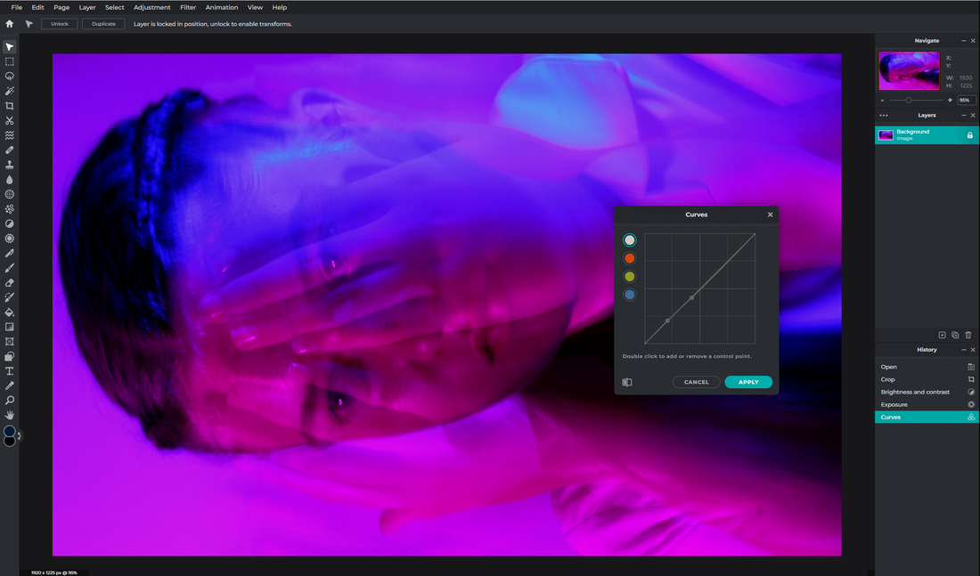
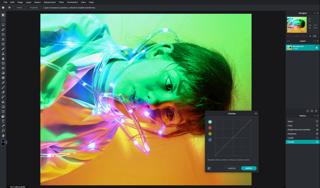
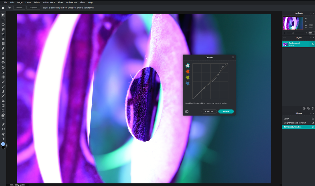
5. Curves Finally, I used the 'Curves' tool under 'Adjustments' which enabled me to adapt the quality and appearance of the image in different places. Personally I am a huge fan of this tool as it allows you to specialise what section of the image you would like to change. |
Experimenting with Light // Bokeh Workshop / 4 Edited Images

|

|
1. To create this first image we used an additional technique where we placed a plastic bag over the lens of the camera. This allowed us to create a fuzzy / steamy affect to the photograph which also added depth and dramatized the image. This technique additionally created a Bokeh affect in a unique way I had never seen before. Using PIXLR I edited this image by adapting the exposure, curves, levels, brightness, contrast and cropped the image following the steps above. I think by doing this I have enhanced the image quality and overall this would be one of my most successful photographs from the shoot.
2. While taking this photograph and additionally editing it I took the composition into great consideration. Due to the model's eye being the focal point of the image I wanted to enhance this by making it stand out even more to the viewer. During the shoot we placed the blue fairy light near her eye to make it stand out and almost look like it was glowing. Next, throughout the editing process I made sure to crop the image so the eye would link perfectly with the rule of thirds and I made sure the eye was as bold as possible. Overall I think this image was also very successful and I am extremely happy with how it turned out.

|

|
3. This photograph stands out from the rest of the images due to its differing composition. While editing this image I wanted to create a clear definition of the foreground, midground and background of the photograph. Not only did I intentionally place a large quantity of lights in front of the model to do this but I also tried to make the coloured lights look as bright and artificial as possible. Above is my editing process of this photograph. Once again I think this image was successful and I like the idea the model isn't the main focus of the image.
4. Finally, this image is most likely my least successful outcome. Once again I followed the steps above but I feel during the shoot I could of included more bokeh techniques and I could have highlighted clearly where the main focal point of this image is. Overall I think if we reconsidered the colours we used and the composition this photograph could be a lot different and a lot better.
Experimenting with Light // Bokeh Workshop / Best Edited Image/ Final Outcome
|
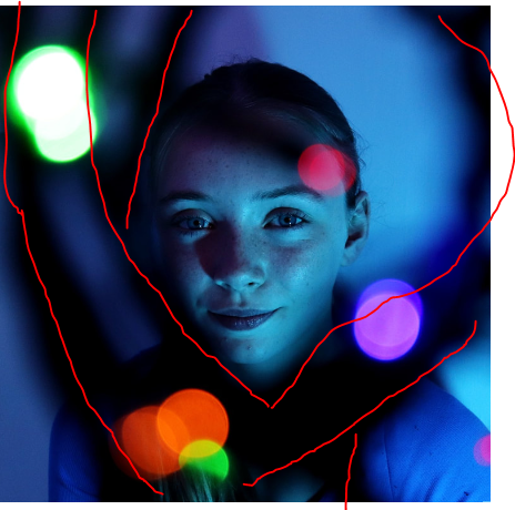
Here is my final edited image. I chose this as I thought it sums up the definition of Bokeh photography the best. One aspect of this photograph I like is the contrast between the foreground and the middle ground. I chose to have the model in the middle ground of this shot and almost create a monochrome effect. I think doing this makes the viewer see the model as innocent and delicate due to their presence but not definition. By making the different grounds clear I have been able to make the model look like she is hiding from something which I really like. On the other hand I hoped the model would of been in focus more and I would of liked if model's clothing was clearly in the middle ground, to define the innocence and show the hiding affect. The technique of Bokeh photography links very well to my research of Brandon Woelfel and his use of this technique although his model's are usually placed in front of the Bokeh. On the other hand this image doesn't directly link to my research of Lindsay Adler's work apart from the experiment of light and colour. But, I could in the future include some Colour Gels to improve this image even more. Overall I think this image fits perfectly to our topic of 'Portraiture and Identity, Conceal and Reveal' as it not only is a portrait image but also uses the theme of conceal and reveal throughout, which links back to the definition at the start of this project.
|

|


- Here I edited my final image to monochrome and then I went further to change the hue and saturation on PIXLR, the editing snip is above.
Experimenting with Light // Bokeh Contact Sheet // Shoot 2 / Home Shoot

|

|
Shoot 1: 9 Experimental Images


Experimenting with Light // Bokeh Workshop / 4 Edited Images

To edit this image I used the same editing process shown previously for Bokeh photography (crop, brightness & contrast etc).To me this photograph coveys a message of loss and sorrow and while editing I tried to prove this. Below I further edited this image and took advantage of the presence of the light strings by using this as a tool to enhance this message.

In this image the exposure was originally extremely dark. While editing I wanted to change this but by doing this the vibrancy of the model's eyes have reduced. Although this wasn't successful I think the bokeh in this image has worked well to surround the head and the rule of thirds is apparent.
|

While editing this image I wanted to develop the model's emotion through the photograph. To do this I wanted to increase the exposure and the brightness to position the model as a light in the darkness. I did this by cropping the image to remove any of the white background and adapting the curves.

In this photograph I cropped the image to ensure the rule of thirds was used to make the model's eye the focal point of the image. Although that was successful I dislike the string from the fairy lights which have disrupted the image, but this could be seen as a way to make the eye more significant.
|
- Here is the second edit of my photograph from above. I have taken advantage of the light strings and edited it to portray the idea I have explained in the first of the ' 4 Edited Images'.
Experimenting with Light // Bokeh Workshop / Best Edited Image/At home
Some things in this photograph I would like to change in the future are the composition of the light strings and the quantity of the bokeh effect. Next time I would make sure the light strings are as symmetrical as possible so the composition is clearer and I would try to introduce more lights. I would additionally consider the colours in the photograph as this would help portray the emotions throughout the image. Overall I think this image is successful and it links to our study of light throughout photography very well as I used the Bokeh technique and colour gels (to adapt the background colour). |
Here is my final edited image. I chose this due to the contrast within the different grounds of the photograph to portray the model as a light in the darkness. While editing, I loved that the lights had positioned themselves around the model's face, therefore I wanted to expand and experiment on this idea. To do this I cropped the image so the light strings were seen as a border around the face and I used the curves and contrast tool to make the model and her surroundings juxtaposed. Not only do I like the leading lines and emotion within the photograph, I also think the rule of thirds is effective resulting in the focal point being the brightest aspect of the image.
Colour Swatch

|

Experimenting with Light / Motion Blur Workshop / RGB Colour
Then this will allow you to add motion blur to your photographs by coming up with different movements.
|
Technique // Colour Gels, Motion Blur:
Motion blur is an effect used in photography which intentionally blurs an image. Due to a slow shutter speed you can create different shapes and patterns by moving your body. We used an f/stop of 8. Overall this technique creates unique images by a simple movement. How to re-create this shoot: To re-create this shoot, the first thing you need to do is set up the Colour Gels. You can do this by placing a vibrant light at an angle to the subject, making the model's face different colours. Once you have found the colour combination which satisfies you, you can set the camera settings to what was explained above. |

|

|


Experimenting with Light // Motion Blur Contact Sheet // Shoot 1 School

|

|
Shoot 1: 9 Experimental Images


Experimenting with Light // Motion Blur Workshop / Editing Process

|
1. Crop Firstly I cropped the image which then also allowed me to adjust to the rule of thirds, which in this image would lead you to the face where the motion blur of the hands are. |
|
2. Brightness and Contrast As shown before this tool is found under ' Adjustments' and was extremely useful in this editing process. This helped the viewer see the hands were there and signified the motion blur better while still being able to see the face due to this effect. |

|

|
3. Exposure Here I adapted the exposure which allowed me to make the photo look more mysterious and made the fact my hands look invisible more believable. This tool is also found under 'Adjustments'. |
|
4. Levels Here I could use the levels tool but I chose to keep it the same as this tool is more effective in when shooting in monochrome and as I experimented I found the levels looked best if I kept them the same. |
|
|
5. Curves Here I adapted the curves. This is also found under 'Adjustments' and I find this tool extremely helpful when editing all photographs. In this case it allowed me to make the hands look more realistic. |
Experimenting with Light // Motion Blur Workshop / 4 Best Edited Images

|

|
1. To create the first photo I moved my head back and fourth to create a motion blur effect. This did work but I think my eyes could have been shown clearer. To edit this photo I used the process above. I think this photo was partially successful and I would make it better my moving my head slower.
2. Secondly, this image was extremely successful. Here I moved my hands from the front of my face round to the back of my head. I think this turned out very well as you get the motion blur effect and you can still see my face through my hands which makes them almost invisible. To edit this photo I had to use mostly the curves and brightness and contrast tools which made the hands clearer and more visible.
2. Secondly, this image was extremely successful. Here I moved my hands from the front of my face round to the back of my head. I think this turned out very well as you get the motion blur effect and you can still see my face through my hands which makes them almost invisible. To edit this photo I had to use mostly the curves and brightness and contrast tools which made the hands clearer and more visible.

|
|
3. Thirdly this image was also a huge success. I think this image fits the motion blur topic very well as you can see 3-4 faces in one photo and each time to you look you see different perspectives and interpretations of the photograph. While editing I then made sure there was a color difference between each face so you can see each face easier. Although this was mostly successful I think I could improve the editing as the bright pink can be overpowering.
4. Finally this photograph is similar to the first. I think this one was most likely more successful as you can see each facial feature carried throughout the photograph, but on the other hand I could improve the composition by cropping the top down more to make the facial features definitely the focal point.
4. Finally this photograph is similar to the first. I think this one was most likely more successful as you can see each facial feature carried throughout the photograph, but on the other hand I could improve the composition by cropping the top down more to make the facial features definitely the focal point.
Experimenting with Light // Motion Blur Workshop / Best Edited Image / Final Outcome

My two best edits link well but also illustrates differing stories and perspectives. This photograph links well to Lindsay Adler's work, but I would like to experiment with the introduction of Bokeh photography to motion blur images.
|
Here is my final edited image. I chose this image as I think you can clearly see the different layers which makes this image motion blur. In this photograph I like that you can clearly see my arms and hands in the foreground but you can also see my face and the rest of my body in the background. Secondly I think the choice of colours compliment each other but I would have liked the colour gels to be clearer. I could do this by tilting my head further to the left of the image. During the editing most of the time I was making the hands clearer to make the motion blur more visible and effective. While doing this the right corner of the image has become pixelated and also has some unintended motion blur. If I was to do this again I would definitely take that into consideration. I think this image links well to our topic as this image, like the previous best edit, involves Conceal and Reveal. But on the other hand, throughout this image the model is unable to hide behind the motion blur.

|
Motion Blur / RGB Lights Shoot 2 / Intervention/ Contact Sheet

|

|
Experimenting with Light / Tube Lighting / Colour Gel Workshop
I would then add tube lights to make it a tube light shoot and adjust my settings depending on the surroundings and the lighting.
|
Technique // Colour Gels:
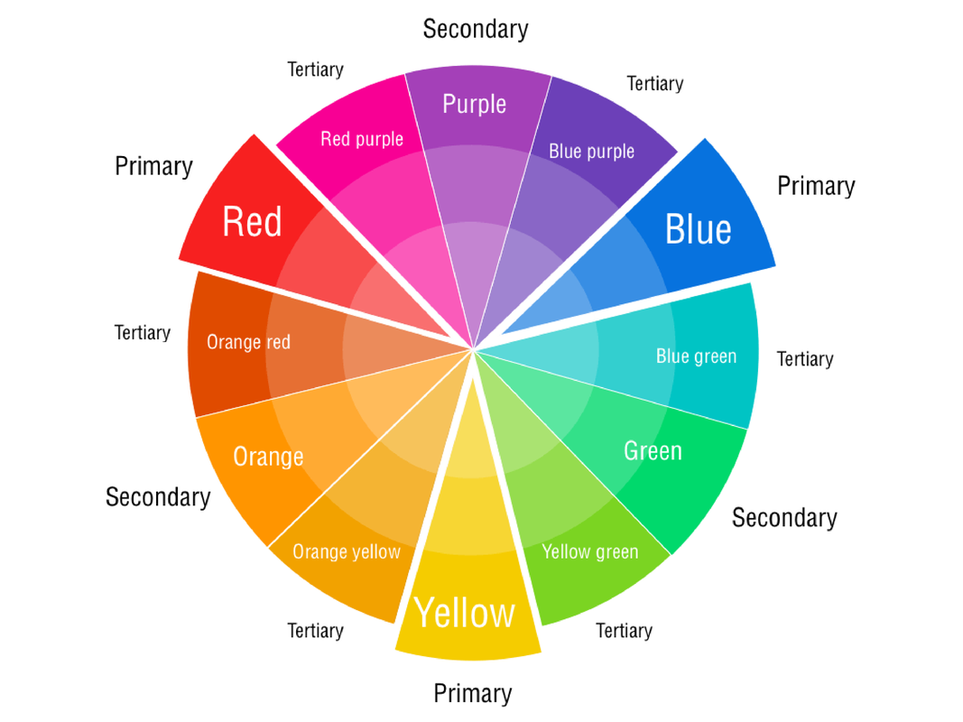
Colour gels (also known as colour filters) are thin, square-shaped pieces of coloured transparent material used to place over a lighting source. Visual artists use colour gels to control the colour in their work. People have been practicing colour gel photography since the 1600s. How to re-create this shoot: To shoot with Colour Gels you first need to choose some colours which compliment each other. You can do this with your personal preference or you can use the colour wheel shown. Personally I would use coloured lights and project them in different directions on the face. |

|

|

|
|
|
|
Experimenting with Light // Tube Lighting Contact Sheet // Shoot 1
Shoot 1: 9 Experimental Images


Experimenting with Light // Tube Lighting Workshop / Editing Process

|
1. Crop Here I cropped my original photo which made the model's face the focal point of the photograph. By doing this the viewer's eyes will be able to lead around the photo easier. |
|
2. Brightness and Contrast Next I changed the brightness and contrast. This allowed me to make the tube lights stand out from the rest of the image and enhance specific facial features like the model's eyes and lips. |

|

|
3. Exposure Then I changed the exposure of the photograph which made it more dramatic and also allowed me to prevent the lights being too powerful on the model's cheek otherwise the camera picks it up as a white light. |
|
4. Levels Next I changed the levels slightly but as this image isn't monochrome this technique is not as effective. You can find this under 'Adjustments'. |

|
|
5. Curves Finally I used the curves tool which allowed me to perfect each feature on the photograph. |
Experimenting with Light // Tube Lighting Workshop / 4 Best Edited Images

|

|
1. I chose this photograph due to the composition of the image. I feel it was successful in this way due to the juxtaposing space around the subject and the background. The model in this image looks trapped and lost whereas the back ground is simple and clear. I additionally think the use of colours in this photograph have worked well as the red and green compliment each other. While editing this image I had to adapt the exposure so the red was more powerful on the face and created a successful colour gel image. Overall this is successful although the shadow in the background is distracting.
2. Secondly I chose this image due to the leading lines. I think the use of the tube lighting is very successful and clearly illustrates the different grounds throughout the photograph. I think the colour gels worked moderately well although I would have liked if the pink wasn't as powerful, although the idea of splitting the model's face into different colours has worked well. While editing this image I had to take that fact into consideration so I made sure to focus a lot of my attention on the pink side of the face.
2. Secondly I chose this image due to the leading lines. I think the use of the tube lighting is very successful and clearly illustrates the different grounds throughout the photograph. I think the colour gels worked moderately well although I would have liked if the pink wasn't as powerful, although the idea of splitting the model's face into different colours has worked well. While editing this image I had to take that fact into consideration so I made sure to focus a lot of my attention on the pink side of the face.

|

|
3. Thirdly I chose this image as it would have been extremely effective if the colours were adapted. Additionally the shadows are a massive factor to why this would not be my best image. In my opinion the shadows may effect the viewer's attention on the photograph and may be very distracting. Therefore when editing I did change the highlights and shadows of the photograph but the shadows are still apparent.
4. Finally I chose this image as the composition worked well. I think the positioning of the colour gels and how they changed the colours of the model's eyes enhances the focal point of the photograph, although once again a change I would make is the colours. Also I would additionally attempt to remove the shadows from the backdrop which could be done by moving the subject and the lighting further forward.
4. Finally I chose this image as the composition worked well. I think the positioning of the colour gels and how they changed the colours of the model's eyes enhances the focal point of the photograph, although once again a change I would make is the colours. Also I would additionally attempt to remove the shadows from the backdrop which could be done by moving the subject and the lighting further forward.
Experimenting with Light // Tube Lighting Workshop / Best Edited Image

Overall I think this image links well to our study, once again, especially 'conceal and reveal' as the model's positioning suggests she is hiding and peering through a window. Finally I chose this photograph as I think if I was to do this shoot again this would be the most successful shot. |
I chose this image as my best edited photograph due to the use of colour gels and composition. I think the way the model is positioned clearly proves the different grounds in the photograph. One feature I like about this image is the leading lines created by the tube lights, which certifies the focus on the model within this photograph. Additionally another successful feature of this image is the focus on the model as this was hard to do and I think this is one stunning factor in this photo. One improvement I would make to improve this image is the shadows on the right of the photograph, which could be easily fixed if we had a chance to do this shoot again. Secondly I think we would be able to take that opportunity to make the pink lighter so the focus is improved. I think this image links well to my research of Lindsay Adler as she focuses on the use of colour gels especially in her portfolio 'Editorial Beauty' which I have linked below. The tube lights additionally include a slight Bokeh effect which links well to my study of Brandon Woelfel but I would love to include more bokeh in this photograph. 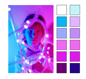
|
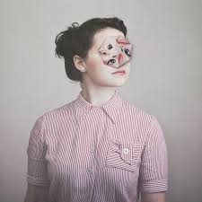
Artist Investigation / Alma Haser


Why did I choose Alma Haser?
How does Alma Haser work inspire me?
|
When choosing a photographer to research Almer Haser stood out to me due to how abstract and questionable her work is. I love the way she hides people's identity and replaces it with an unrecognisable face. Not only does this stand out to me but I also enjoy the different styles of her work for example, creating a jigsaw, using origami and scrunching up paper. I think these methods aren't only effective to make the photograph more appealing and interesting, but they also express the model's emotions through photography and physical editing. |
|
'For me the photograph is the backbone to my practice, something I use both to start and finish pieces. The start is always the photograph which I can then use to create the wider body of work.'
|
How does this link with our topic?
Almer Haser's work is an excellent example of a photographer who links to our topic. She uses portraiture to conceal people's identity using physical editing. By doing this Haser's form of photography is another unique way to experiment with portraiture especially 'Conceal and Reveal'. To me, the quotes displayed at the start of this topic sums up Almer Haser's work. The quote below especially reminds me of her work due to the different ways Haser presents people. 'I am made and remade continually. Different people draw different words from me.' -Virginia Wolf |
Why does this technique appeal to me?
These techniques appeal to me above many other photographers due to how incomparable each image is. You can experiment and create many images from one original photograph which look completely different. I think these methods are a great way to display a simple portrait by distorting parts of the body and I love that these are physically edited, as this is an unusual but creative way to present an image.
These techniques appeal to me above many other photographers due to how incomparable each image is. You can experiment and create many images from one original photograph which look completely different. I think these methods are a great way to display a simple portrait by distorting parts of the body and I love that these are physically edited, as this is an unusual but creative way to present an image.
Processes and Techniques of Alma Haser
'Expanding the dimensions of traditional portrait photography, Alma takes her photographs further by using inventive paper-folding techniques, collage and mixed media to create layers of intrigue around her subjects; manipulating her portraits into futuristic paper sculptures and blurring the distinctions between two-dimensional and three-dimensional imagery.' - Alma Haser's website
'Expanding the dimensions of traditional portrait photography, Alma takes her photographs further by using inventive paper-folding techniques, collage and mixed media to create layers of intrigue around her subjects; manipulating her portraits into futuristic paper sculptures and blurring the distinctions between two-dimensional and three-dimensional imagery.' - Alma Haser's website


|
How can I emulate Alma Haser's work?
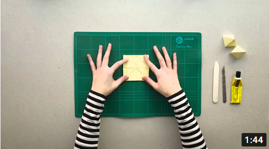
To emulate Haser's work I would first start by choosing my location. In this case it would be suitable to have natural light inside so there is no movement in the background and I could have a plain wall to work with. Next, one key thing to take into consideration in Haser's work is the clothes worn. It is apparent in all of her photos the model's are dressed in plain, light coloured clothing which allows the face to be the focal point of the image. After setting up my background and choosing the model's clothing I would set up my tripod and take a simple photograph of the model using the portraiture mode on my camera. In my opinion to carry out the physical editing process I would print the image multiple times and use the origami technique or any others shown to place on top of the original photograph. Finally I would photograph this and edit my result after possibly cropping the image or adapting the curves or exposure using PIXLR. |

|
How can I emulate Alma Haser's work?


- Here are 2 different style of Alma Haser's work I have emulated from one initial image shown below

|

|
Shown above are the pre-edit and post edit photographs. I will use these to try to emulate Almer Haser's work in two different styles. While taking this image I used the portraiture mode on my camera with an ISO of 400, an f/stop of f/5 and my shutter speed was 1/60. To edit this image I used the brightness and contrast tool, the exposure, curves and cropping tool to enhance the image quality.

|

|
Shown above are the final outcomes of my work. To emulate Almer Haser I decided to fold several photos of the initial image into differing pieces. I then secured these will blu-tack on the original photograph. For the second emulation I cropped the original photo, scrunched it up and once again secured this to the original photo. Some ink has not printed right therefore some parts are lacking in colour as this was done at home during the summer break.
Overall I am pleased with both images. I think the emulation has been successful as I have used the same methods and physically edited the photograph. I also kept the clothing basic so all the attention is on the face and this made the final outcome more successful. On the other hand I think I could of edited the image better as some parts don't look natural, although some could be down to the printing. Shown below I have also included these same photographs in monochrome to experiment further and to explore what difference colour makes to a portrait. Overall I think changing these to monochrome leads the viewer to focus further into the texture of the image.
Overall I am pleased with both images. I think the emulation has been successful as I have used the same methods and physically edited the photograph. I also kept the clothing basic so all the attention is on the face and this made the final outcome more successful. On the other hand I think I could of edited the image better as some parts don't look natural, although some could be down to the printing. Shown below I have also included these same photographs in monochrome to experiment further and to explore what difference colour makes to a portrait. Overall I think changing these to monochrome leads the viewer to focus further into the texture of the image.

|

|
Further Editing
I then expanded my work by developing it further. This used past editing skills from the previous Abstract Nature project which made this image even more abstract than it already was. I enjoyed combining these two topics together in my spare time as it made me realise the endless opportunities to adapt a photograph.

|

|
Physical Composition Design 1

|
What is the aim of this Physical Composition?
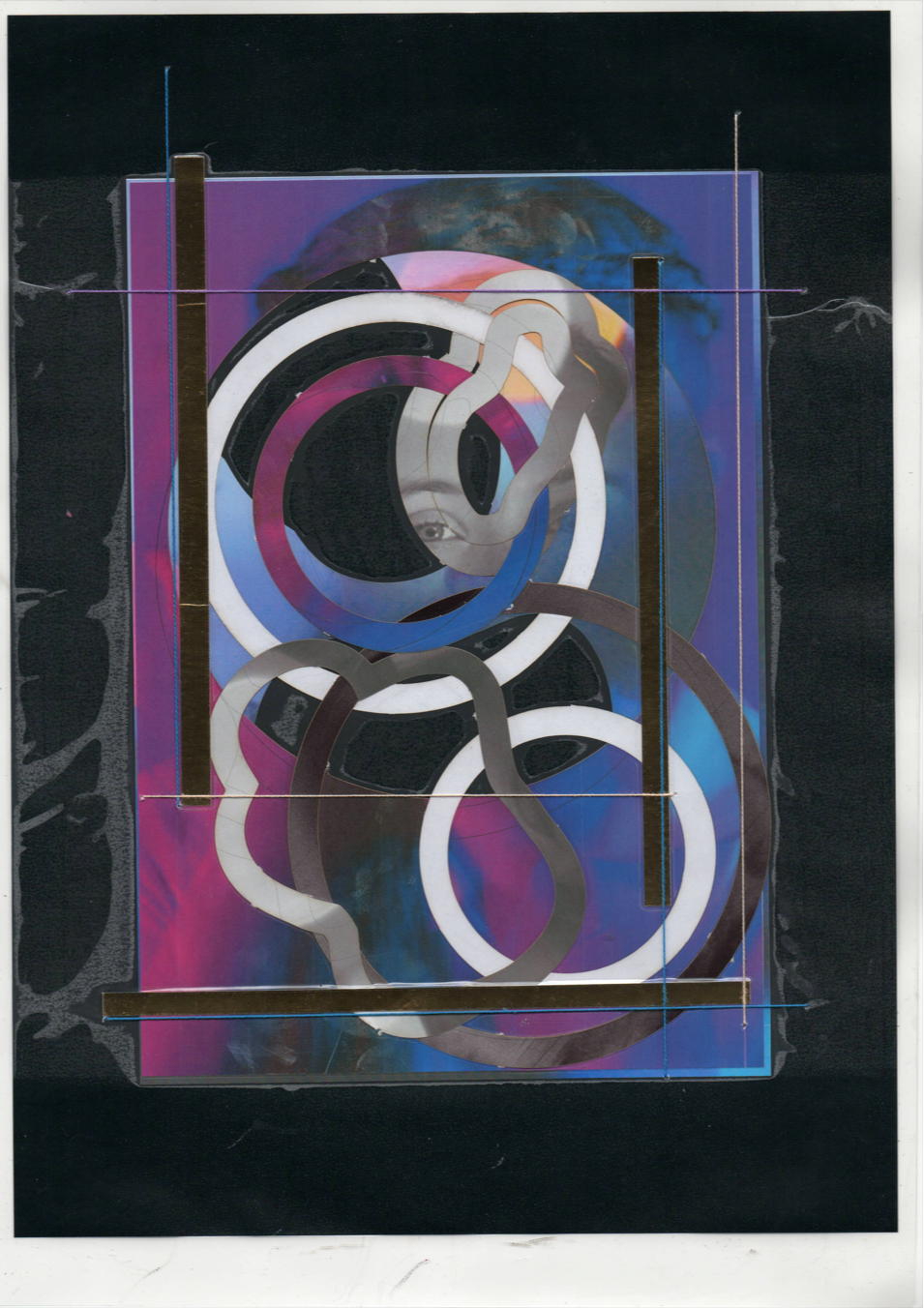
My plan for physically editing this image is to alter the identity of the model by using our topic title of 'Conceal and Reveal.' By physically editing this I would like to hide some parts of the face to conceal her physical features, but then collage these back together to create a new outcome and revealed identity. The initial idea of this image was to use the bokeh technique to hide some parts of the photograph using fairy lights and their strings. By concealing the identity of the model through removing and collaging my work, I intend to create a colourful and happy atmosphere. Although I plan to base my work on a monochrome background I think this mood will still be identifiable and obvious due to the bright primary colours this photograph will follow. On top of this I expect to create a mysterious atmosphere due to the distortion of the image, by manipulating this I still want the face to be apparent but to create an abstract background through collaging and create hints of confusion. Initially this photograph conveyed confidence and a clear vision to the future due to the focal point being the model's eyes (direct line of focus). After physically editing this I hope I can create a juxtaposing idea of confusion and challenges through life. Although this will be the main idea of my photograph, I intend to keep the eye as the focal point of the portrait to portray perseverance through this confusion. 'I am made and remade continually. Different people draw different words from me.' |

|

|

|

|

|
Who are my new inspirational photographers to further my ideas?
To physically edit my photograph I am inspired by the photographers Maurizio Anzeri and May Xiong. Anzeri stiches into his portraits to add extra effect and colour. This inspires me as it adds texture to my work and furthers my abstract work. On the other hand Xiong draws on her work to create leading lines, she mostly uses geometric shapes whereas I aim to use random shapes. I will add this on with a gold pen as this compliments my original colours. Overall I intend to focus on lines and texture to enhance the quality of my work. |
|
Physical editing plan: I will first use the 2D design software to laser cut into my original photo, these will then be printed on a monochrome and a colour page. My idea is to combine these two using the shapes I have created to make the confusing idea of struggle but perseverance throughout my piece. I will then additionally enhance the monochrome background to stitch over some of the bokeh lights using mostly primary colours to convey a bright and happy juxtaposing atmosphere. I will then use a gold pen to compliment these colours by drawing arounds the perimeter of the unique shapes I have created. This will have previously been laminated so I am able to sew and draw on my photograph without damaging the image itself. -Here is me sewing into my work and underneath my final result are the shapes I used to create this piece
|
Physical Composition Design 1 / Part 1 // Final Result

|

|


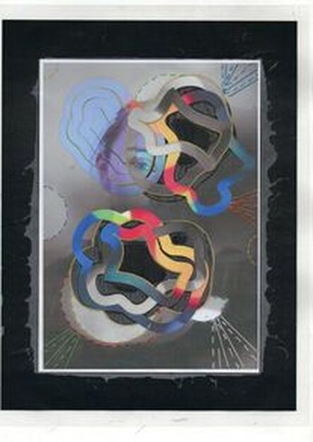
Shown above is my final laminated work. I aim to use this to further my physical editing skills and create an abstract piece. As you can see this piece has already been edited in depth, from rearranging and collaging the image, to changing the colours and adding stitching into my work. I am extremely proud of this result due to the successes of the stitching, I think this adds necessary texture to the photograph and colour contrasting the monochrome background. Due to the bright colours, picked out from the photo, the stitching has enabled me to create a slight cartoon effect which compliments the composition and image well. You can clearly see how significant the simple introduction of colour is, while the shapes enhance this simple addition and is extremely effective. Finally underneath my two results you can see close up shots of my physical piece.
How far has my work come already?
- Comparing my original image and my first part of physical editing, it is evident that the photograph is abstract and developed.
- Comparing my original image and my first part of physical editing, it is evident that the photograph is abstract and developed.

|
|
Physical Composition Design 1 / Part 2
|
How can I take my work to another level of editing?
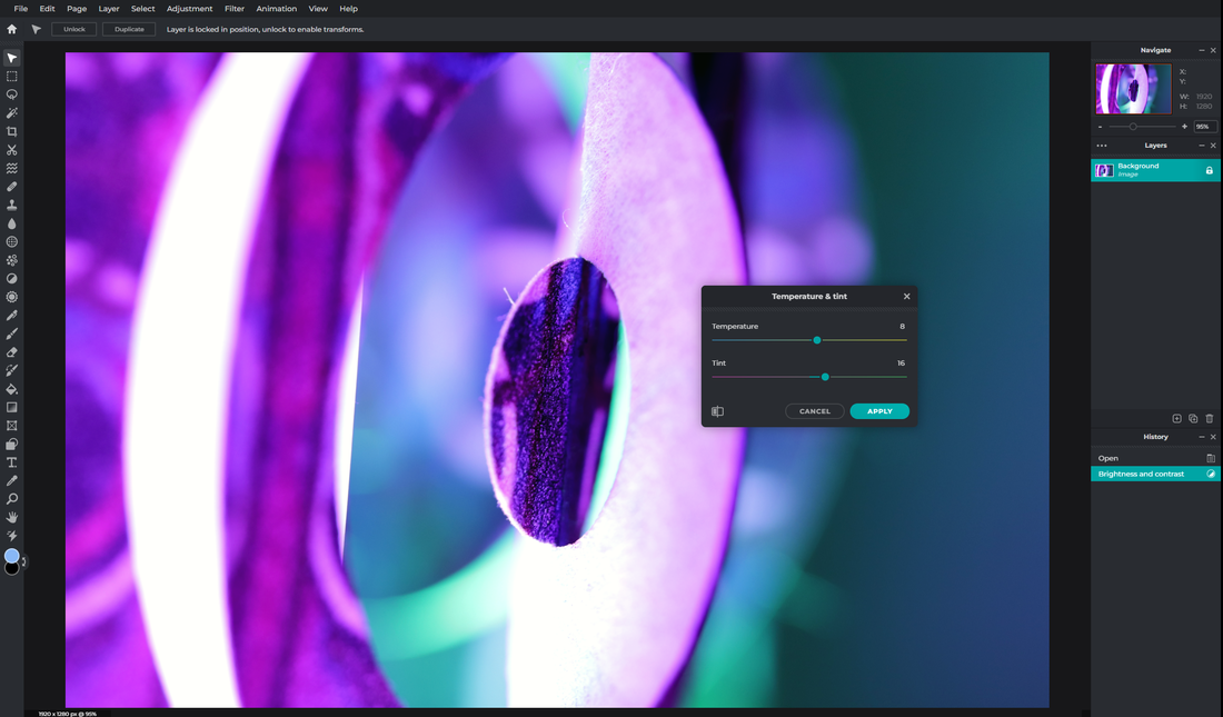
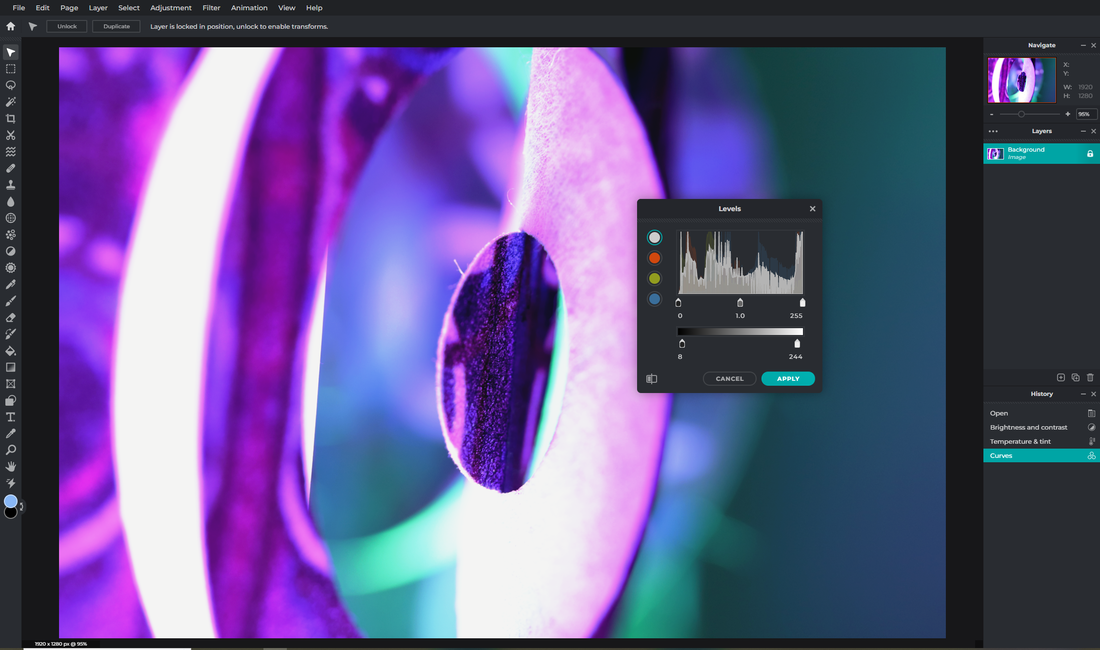
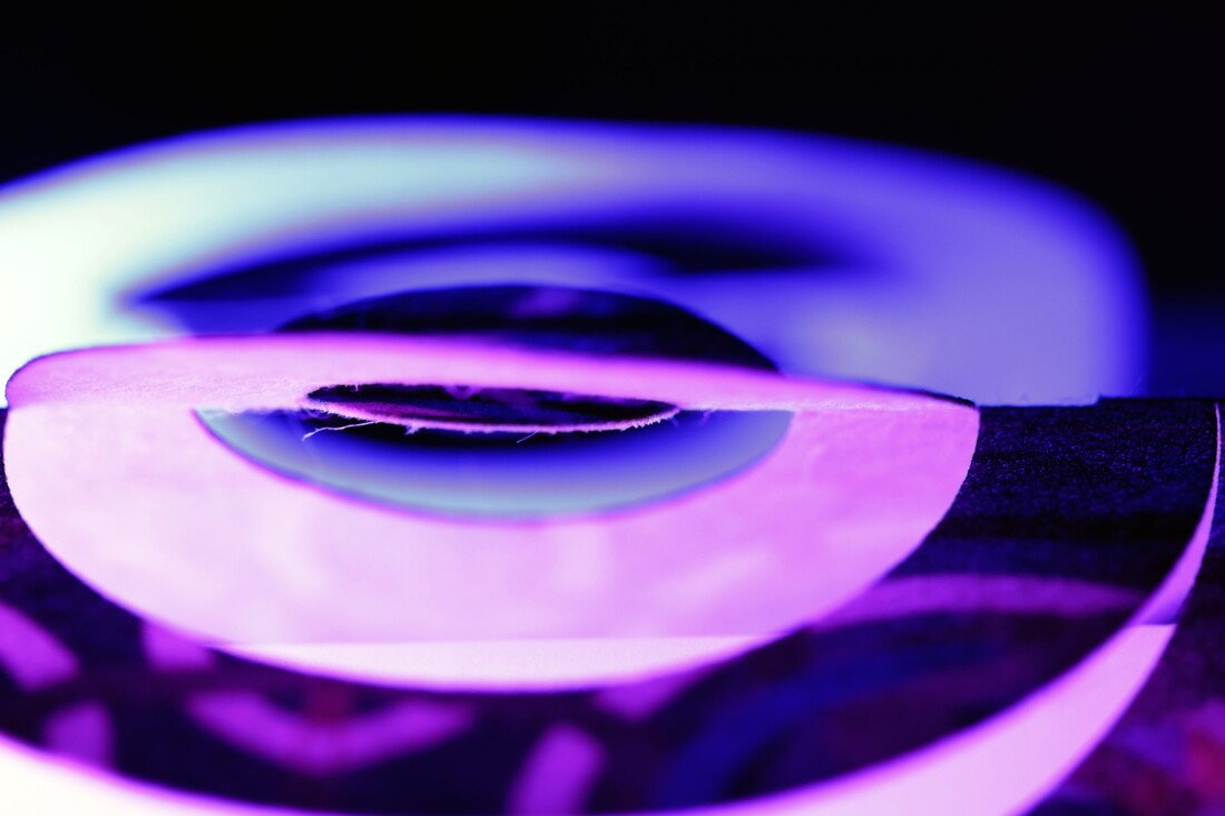
What was my process? Next I gained inspiration from our last project 'Abstract Nature', where I used rotational symmetry throughout my work in many different ways. I wanted to take this idea to create a unusual perspective of my laminated final result. To do this I first took a photograph of my work and cropped this using PIXLR to focus on a certain aspect of the image, in this case the focal point of my photograph. I then used the 'set page size' setting in PIXLR to change my page size and duplicate my work. After this I was left to repeat this step two times while flattening down the image to keep it secure and flipping the photograph so it is symmetrical. Finally, I adapted the temperature and tint under the 'Adjustments' tab so the colours would be clearly displayed and present. I have shown a snip of this process on the right. Additionally I have inserted two rotational symmetry images from our previous project that inspired me. |

|


|
How did I create my board?
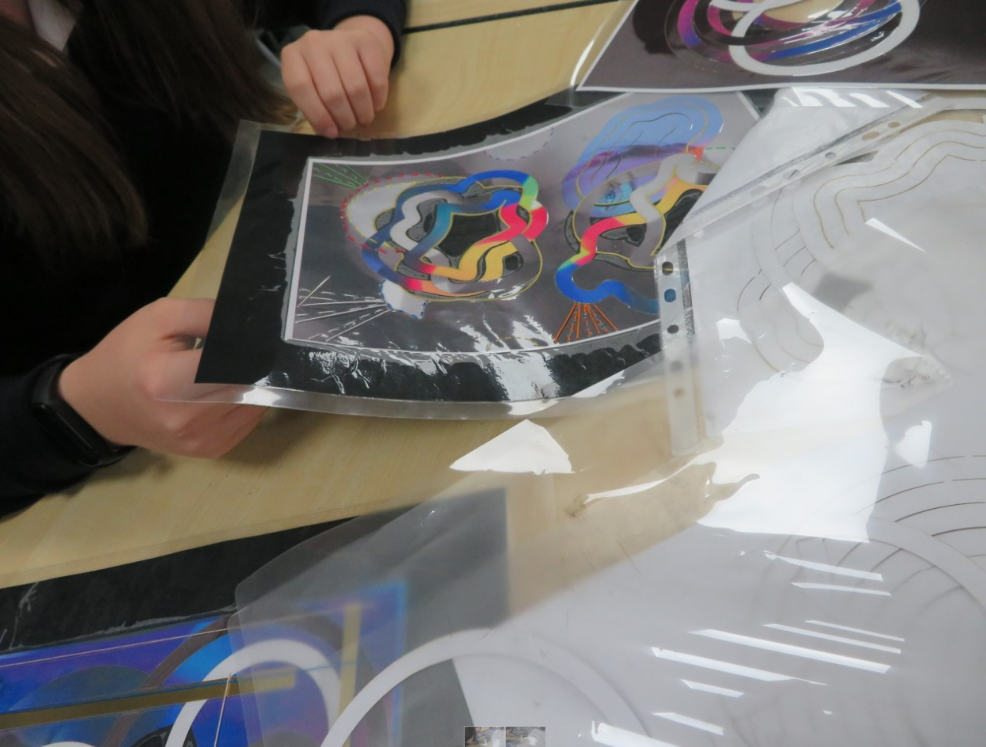
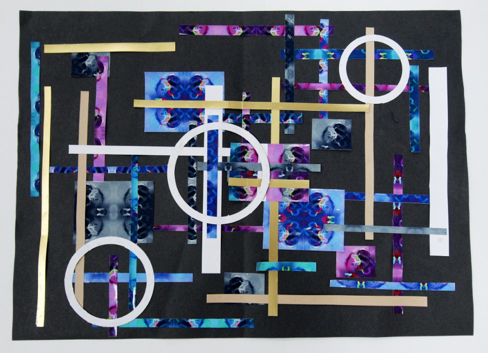
Below you can see I used PIXLR to edit the hue and saturation of my rotational symmetry work. I used colours that were juxtaposing my original piece to edit further. I then cut up my four rotations into lines and shapes to collage back together. Next I used a black background to reduce the bright colours as I think white would be extremely overpowering. From looking at my piece I wanted to pick out a metallic colour to enhance my board and pull all the photographs together where I chose gold strips and added a neutral creme colour. I then chose to add white circles from my previous work to link back to my original piece of bokeh photography and added some cellophane. Finally I added some parts of the original image so the physical editing can be related to my original outcome. |


Outcomes of Physical Editing:

This is a rotational symmetry of my work I created on PIXLR, which you can find a method to on my composition above.
|
|


Final Outcome:
|
On the other hand I could improve this by making the strips straight by using a ruler and possibly drawing out where I was to put things first, although this board is packed think I should add something to finish it off and bring it all together. I could also possibly add more green to do so.
Overall I think this outcome was very successful and the development has come a long way from my first photograph. Ii have included a transition slide on the right so you can see the development of my work. |
I have enjoyed making this outcome throughout the past few weeks as it has let me explore lots of physical editing skills possible with photography.
I think this outcome is very successful due to the harmonising colours and how the project comes full circle to create this outcome. I have introduced the circles which link back to the shapes I added to my laminated boards and the bokeh lights from my first shoot of this project. I decided to add gold strips as this makes the outcome stand out and glisten while linking to the strips I added to my laminated board and the complimenting colours. I decided to add small squares of my images so you could see the resemblance and focus on a portrait/face in this physical outcome, which filled the board and helped me layer strips on top. 
|
Physical Composition Design 2
|
What is the aim of this Physical Composition?
How are you altering the identity of the image/portrait? For my second physical composition I am combining the two final outcomes shown. This consists of motion blur and bokeh photography. The motion blur will create a sense of confusion, contrasting with the clear and focused bokeh work. I intend for most of the work to be purple and pink which has connotations to mystery and royalty. I would like to enhance this idea by adding some gold accents to my work creating the connotations to royalty and confidence. |
'We reveal our joys and successes, we conceal our pain.' 'When you photograph a face... you photograph the soul behind it.' |

|

|

|

|
Who are my new inspirational photographers to further my ideas?
I plan to use sewing and laser cutting throughout my work and collage the pieces together to make a new image. I am hoping this will create a new unique outcome which I can possibly further digitally edit after. The artists I will be emulating and using over my original work are Maurizio Anzeri and Hannah Hoch. Anzeri uses sewing which I emulated in my last piece although this time I plan to use lines to lead the eye around the image and border the focal point of the photograph. Hoch has inspired me to blend together my original images to create a new outcome as I think this is an inspirational way to being all my work together. |
|
Physical editing plan:
For my second final outcome I plan to use sewing throughout my work. I will begin by adding gold strips to my photograph and will go further into my editing by sewing complimenting colours in the same direction but keeping the the face the focal point of my photograph. Studying the physical photographer’s work and their technique, I will begin by making holes into where I will stitch my complimenting coloured lines. I hope this will add further texture to my image and calm down the overpowering colours present. I will then use PIXLR to crop and rotate my outcome. |

|
Physical Composition Design 2 / Part 1 // Final Results
|

|


My first final piece above was extremely successful due to the combination of two final outcomes. At first I wasn't convinced this physical editing would go as planned, as the colours from each outcome are differing. I attempted to avoid this issue by having some of the bokeh shapes in monochrome to reduce any clashes and I think this worked well. Once again I used shapes I had laser cut, but this time from the last outcome proving how abstract this piece is. The circles were introduced to indicate the focal point of the photograph, being the eye and I think introducing some white to the edit brought the piece to life. Overall this piece was a major success but it is a shame the laminate has moved from the image itself although this is inevitable and out of my control.
How far has my work come already?
-It is evident my piece has changed a lot even after merging the two images together although that is the major difference.
-It is evident my piece has changed a lot even after merging the two images together although that is the major difference.

|

|
Physical Composition Design 2 / Part 2
-At this point to create my second outcome from this image I needed to rotate my work, here is the method explained below.
Here is me adapting my page size to duplicate and arrange my photograph to create a rotational symmetry piece.
|
This is the outcome and I used the tools above to flip my image so they line up perfectly. I created a singular square and then merged these together to introduce further detail.
|
- Here is my rotational work of my final outcome and the process I took to create it.
|
How can I take my work to another level of editing?
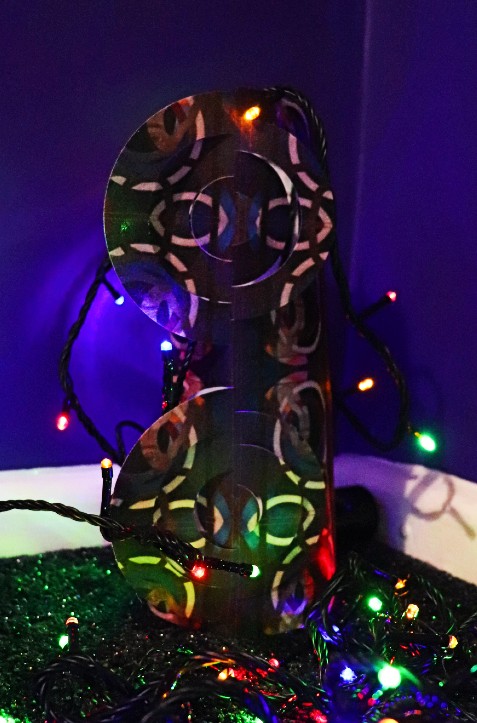
What was my process? When I created my rotational symmetry of my chosen section of the outcome, I was able to sublimate this onto a fabric material. To do this I printed out my rotation and lines them together inside a wallet and used a heat press to sublimate the colours onto the fabric. I then repeated this with a larger rotational symmetry piece in different sizes and images, soon all to be pieced together. |

|
At a similar time I used 2D Design to create circle shapes in an aim to create something similar to what is shown on the right. There is also a link to a video on this sculpture. I found this as I thought it would link perfectly due to the circles on my work and I had never tried this before. To cut out the shapes I sent my document to the laser cutter to cut my fabric so I could piece the sculpture together more accurately. One I finished this I wanted to add lights in a dark room and even tried to create a bokeh effect which rounds off and links to the beginning of this project. Underneath is the video link to the sculpture.
-https://www.youtube.com/watch?v=rPqfPMH2pIg
-https://www.youtube.com/watch?v=rPqfPMH2pIg
My process to creating my final product:
|
Firstly, to create my sculpture I folded the fabric in half into thirds down the diameter of the circles to enable the 3D effect I was aiming for. After trialing different techniques to make the circles pop out I decided this was a good starting point before handling the sculpture and adjusting it to my preference. Next I stuck the ends to each other to create a cylindrical shape using double sided sticky tape as this is what held best. |

|

|

|

|
Then I placed the sculpture over a cylindrical tin and left them for half an hour to attempt to mold them closer to the shape I had in mind as you can see on the left. To prevent my composition from collapsing or falling over I added so tape tubes to the inside for additional support. This stabilized the sculpture and I decided to sticky tape the exposed areas of tape to the fabric circles. I soon added lights and placed them in a dark room to photograph, below are some results of this. |
Final Outcome:
|
Physical Edit Final Outcome: This is my second outcome of this singular image and it is breathtaking to see the development of not only the image from the beginning but even my first edit. When planning my sculpture the idea has been successful although there are many tweaks I could make and the outcome was slightly disappointing. Reflecting on this physical composition the positives I can take are the rotational symmetry work and creating the fabric material in the first place. Additionally I think the introduction of the lights were a success. On the other hand I think the circles would have been drastically different but more visually pleasing by decreasing the size and this would have made the editing process easier. Furthermore, using fabric was a distinctive idea but the thickness made it hard to work with and adjust. While creating this outcome I enjoyed working with the equipment to create the template of this sculpture like the heat press, laser cuter and 2D Design. Next time I think I would use a thinner material or equally use for example plastic or something which is unable to collapse easily and decrease the size of the circles. Overall I think this idea has worked but some adjustments could be made to make this sculpture exceptional. |
Physical Composition Design 2 / Attempt 2 / Photograph

|
Here is me setting up my shoot of the sculpture, where I placed a light beneath the sculpture to light this up as when I previously tried I used fairy lights which was not successful as the sculpture wasn't stable. As a result of this I decided to adapt the shape so it was square as this assisted the 3D circles to spread. I then also used a white background so my photographs weren't disturbed by the surroundings, although in some photographs I produced the background was black. Additionally I added tracing paper inside to support the sculpture and assist the white background being produced.
Overall this method was more successful than last time as the colours compliment the edit more than the fairy lights did. I then turned the lights off so no light apart from the colours were present, this made the photographs as abstract as they are. You can also see below that I didn't photograph the sculpture as a whole, but I focused on the inspirational parts which links back to our Abstract Nature project very well. |
CONTACT SHEET / Sculpture / Physical composition 2 / Part 2
|
|
9 Best Image


4 Edited Images DIGITAL enhancing:
1. Brightness and Contrast - Here I adapted the brightness and contrast under the 'Adjustments' mode which made the colours bolder.
3. Curves - Here I used the curves tool which helped me to specifically change the appearance o certain sections of the photograph, this is great as it prevents me from changing the whole image.
|
2. Temperature and Tint - Here you can see I changed the temperature and tint, once again under 'Adjustments' which helped me to slightly change the ratio of colours in my image.
4. Levels - Finally I used the levels under 'Adjustments' to tone down the photograph by making it easier to look at and more visually pleasing.
|
4 Best Edits:

|
|
1. This image is one of my most successful of this shoot due to the composition of the photograph. I love how the circle in the middle is perfectly in focus while the rest of the image is blurred, this gives the picture a good focal point. Additionally I like how the right of the image is mainly a turquoise colour and the left is purple but these colours both meet in the middle, also assisting the focus of the photograph. On the other hand I think this image could improve if the extra bits of thread (distracting the viewer) were removed in the digital editing process. Overall I think this edit was extremely successful and the journey the photograph has come on is significant.
2. Secondly this image was very triumphant, due to the repetition in the photograph. I think the blue blurred repeated pattern is very effective due to its subtle presence in the photograph. I think the colours in this image are directly contrasting but remind me of space and the universe due to the rings repeated in the image. Although, once again, the extra pieces of thread should be removed from the photograph. Furthermore, I should have adapted the composition by cropping the image further so the focal point is directly central and there are no distractions in the right hand corner.
2. Secondly this image was very triumphant, due to the repetition in the photograph. I think the blue blurred repeated pattern is very effective due to its subtle presence in the photograph. I think the colours in this image are directly contrasting but remind me of space and the universe due to the rings repeated in the image. Although, once again, the extra pieces of thread should be removed from the photograph. Furthermore, I should have adapted the composition by cropping the image further so the focal point is directly central and there are no distractions in the right hand corner.

|

|
3. This image is certainly one of my weaker photographs out of the four best images due to the composition of the focal point, I wish this was central with black space surrounding the subject. One part of this photograph I like is the blur as the viewer's eyes are led right, across the image. This makes the viewer question the reasoning for this and introduces a curiosity about the abstract image. Oppositely I think this photograph could be significantly improved if I got the opportunity to retake this shoot as I would rotate the sculpture so the fabric had detail and the sublimated side would be shown.
4. Finally this image is very powerful in my opinion. I think this due to the use of space across the image. I think the dark space makes the viewer focus on this emptiness and introduces the idea of a 'clean' image with no distractions but just dark space. Additionally this makes the reader feel peaceful contrasting to the right hand side where the viewer has so many aspects to focus on. To improve this photograph I would add another colour or crop some of the right hand side out so the blue isn't too overpowering and the dark space could be appreciated.
4. Finally this image is very powerful in my opinion. I think this due to the use of space across the image. I think the dark space makes the viewer focus on this emptiness and introduces the idea of a 'clean' image with no distractions but just dark space. Additionally this makes the reader feel peaceful contrasting to the right hand side where the viewer has so many aspects to focus on. To improve this photograph I would add another colour or crop some of the right hand side out so the blue isn't too overpowering and the dark space could be appreciated.
|
Final Outcome:
On the right is my final outcome of this physical editing process. The development of the image has come an extremely long way and I am happy with the overall outcome of this section. I have chosen this image as my most successful photograph out of my final shoot due to the composition and the colours exaggerated using the lights. I specifically arranged the sculpture so the centre circle was clearly in focus using the rule of thirds and during my editing process this assisted me by cropping the image. 
Overall you can see the colours displayed are complimentary and therefore makes this photograph easy to look at. On the other hand some downfalls of this photograph are the process in making the image and the exposure. As the result of my first shoot didn't go as expected I decided to redo this and the brightness could have been controlled better.
Finally I think this shoot and physical editing process was a major success and I love the outcomes I eventually made. |
I enjoy the fact that the left hand side is brighter and almost overpowering whereas the left is a subtle blue colour , this then merges in the centre to create the dark blue and purple on the circle. The shallow depth of field allows this photograph to be illuminous and exciting as the viewer is unaware of the surroundings and could question the location of the shoot. Furthermore, I see this photograph as an abstract image which links full circle to the last project. On the left you can see the transition between the steps to create this outcome. From blending two images together to creating a sculpture, I have been able to make the start point and the final outcome unrecognisable from each other.
|
Outcomes of Physical Editing:

Here is my final outcome of this image. I laser cut the fabric and then put it together to create the sculpture. Next I lit it up and took some close-up shots.
|

Here is my rotational symmetry which you can see the method to below. I think this has been very effective by selecting the focal point of the photograph and taking it to another level.
|

Shown above is my final piece of this singular photograph which has been developed extremely by rotating and then further physically editing this piece.
|

|

|

|
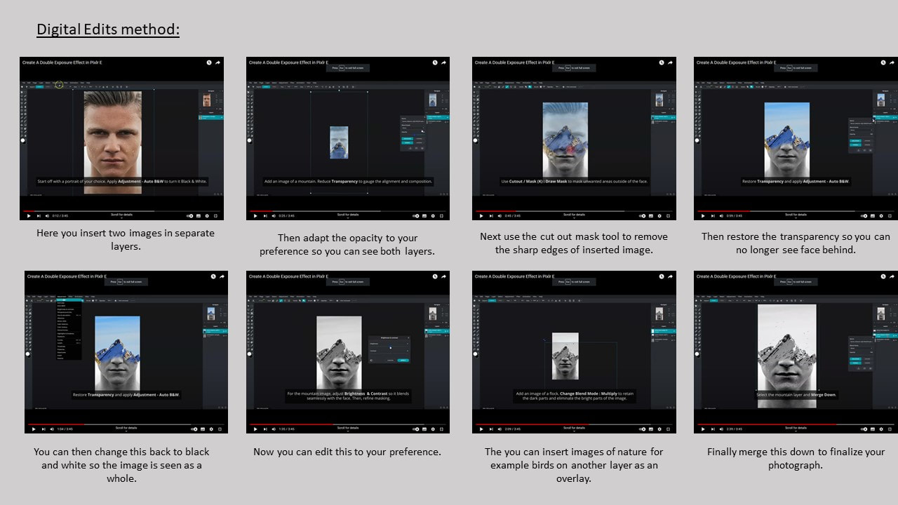
Digital Composition - MOCK EXAM PLAN / multi exposure
|
My chosen photographer:
Here I have chosen my double exposure photographer of Antonio Mora. Spanish artist Antonio Mora is famous for his portraits that merge dream worlds with reality. Starting his career as a Creative Art Director in 1995, he decided to concentrate fully on his own art after 15 years, and now works on his ongoing series, Dream Portraits. He uses double exposure which almost overlays two images to create a unique portrait, some transformations of a face to a building, which is what I intend to emulate. |
|


What is the aim of this Digital Composition?
My aim from this composition is to further my work from this project like I have shown through my physical edits previously. I intend to sustain the mood of confusion due to all of my past projects being linked to this emotion, additionally the form of double exposure I have chosen links to this idea very well. Although this part of my project will link closely to the work I have already produced I will take this on a tangent by introducing images of architecture from Liverpool. My contact sheet of this shoot is shown below. From these images you can relate to the confusion through the model's faces, by removing this significant identification you can introduce the idea of concern and confusion. Although this is a digital composition I aim to tie all of my work together into these pieces by using different images from all the photography we have done.
My aim from this composition is to further my work from this project like I have shown through my physical edits previously. I intend to sustain the mood of confusion due to all of my past projects being linked to this emotion, additionally the form of double exposure I have chosen links to this idea very well. Although this part of my project will link closely to the work I have already produced I will take this on a tangent by introducing images of architecture from Liverpool. My contact sheet of this shoot is shown below. From these images you can relate to the confusion through the model's faces, by removing this significant identification you can introduce the idea of concern and confusion. Although this is a digital composition I aim to tie all of my work together into these pieces by using different images from all the photography we have done.
|
Shoot Plan:
Matt Wisniewski is a 26 year old American artist and software engineer. He experiments with fashion and nature mash-ups, where I will specifically focus on portraiture. I plan to emulate this using my work from Liverpool but my photographs will be inspired by his work. Below I have linked his website where all of his work is displayed. On the right is my plan to edit my photographs and below is also my contact sheet of the images I wish to use. If you click on the image there is also a link to the video. |
|

|
Secondly I plan to further edit my image after I have created the double exposure photograph. By adding the ripped paper I can use this to hide and reveal certain aspects of my work which will link nicely back to every piece of work in this project.
'We reveal our joys and successes, we conceal our pain.' Initially I chose this quote as it was a great way to display emotions through portraiture. This quote has then been significant to all of my work and has been my inspiration throughout the project.
|
Below you can see the photographs I intend to work with to complete this Mock exam from a variety of the past shoots I have carried out.
Digital Composition - MOCK EXAM PLAN / CONTACT SHEET
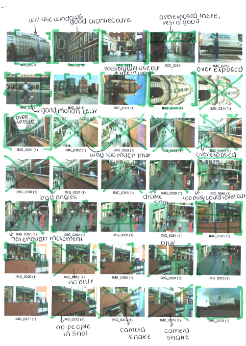
|
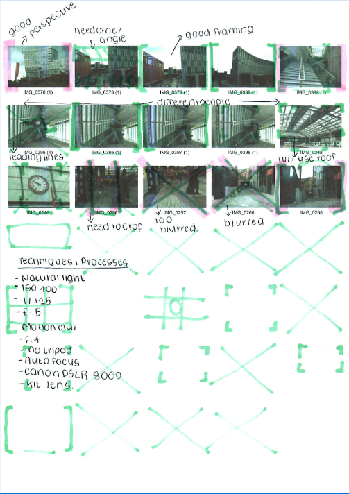
|
8 I mages used for the Double Exposure Digital Editing


Editing Process:
-Here is the editing process to how I created each of my images.
-Here is the editing process to how I created each of my images.
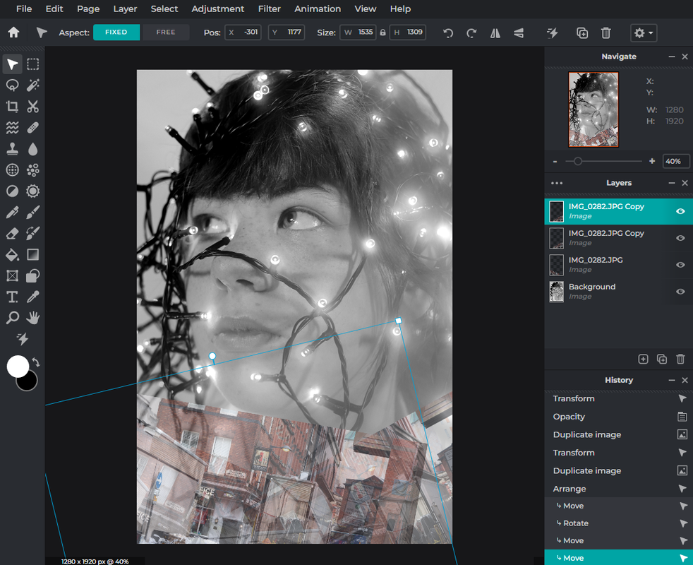
Firstly I inserted my original image and put it in black and white, I then added my architecture image and I decided to make a border around the face while turning down the opacity.
|
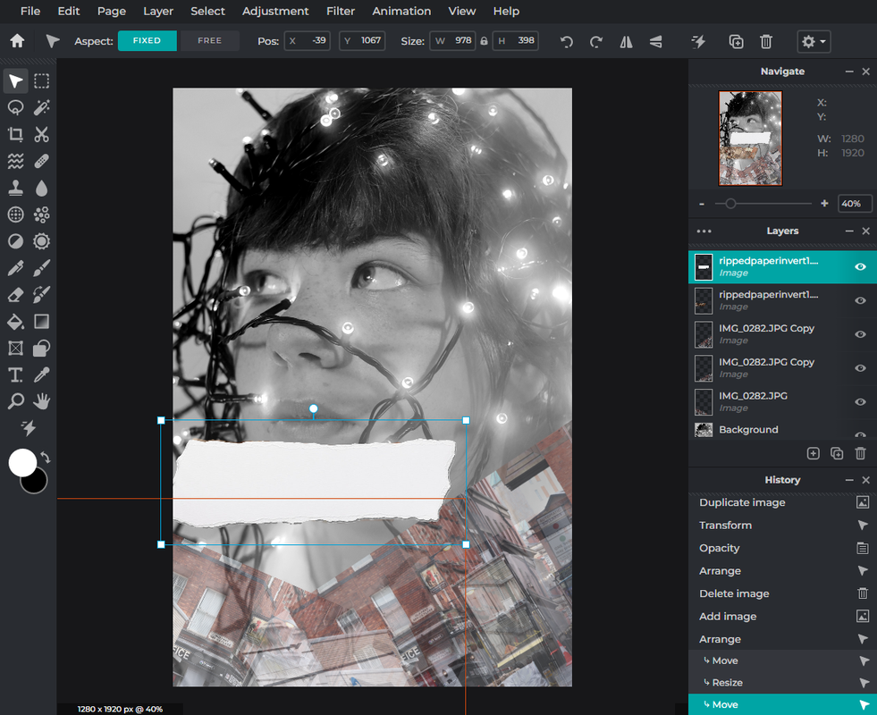
Next I inserted my ripped paper as a new layer and I moved this to where I want it to place an image on top.
|
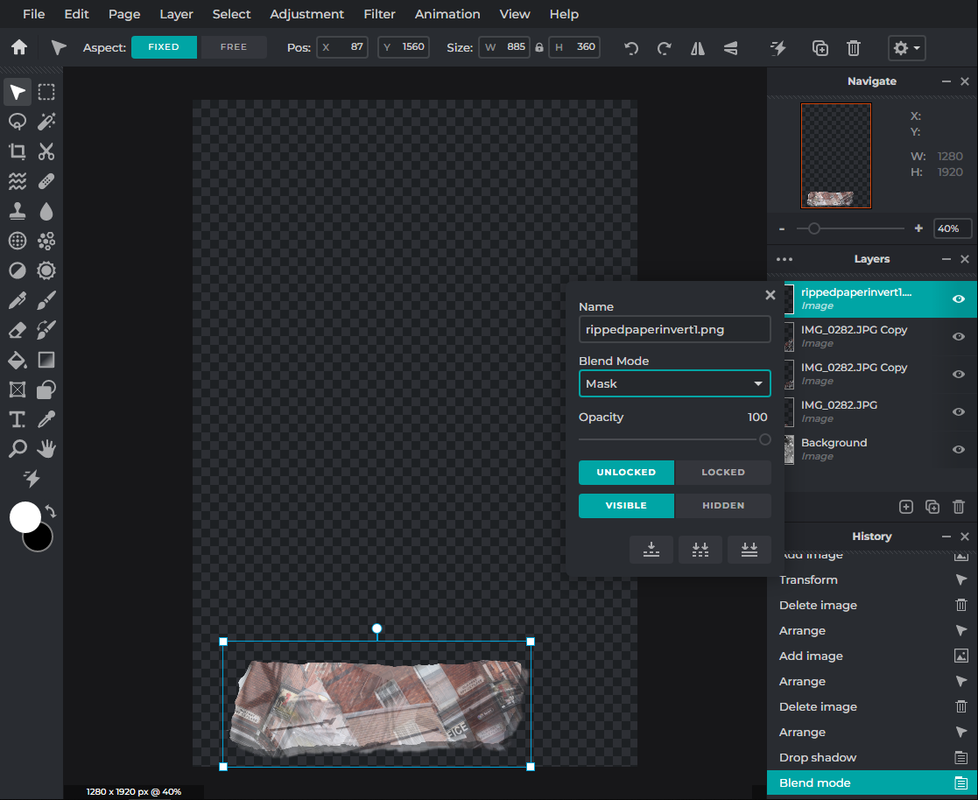
Then I used the mask tool and the drop shadow tool to create a shadow behind my paper so it is realistic and so my image would print on top.
|
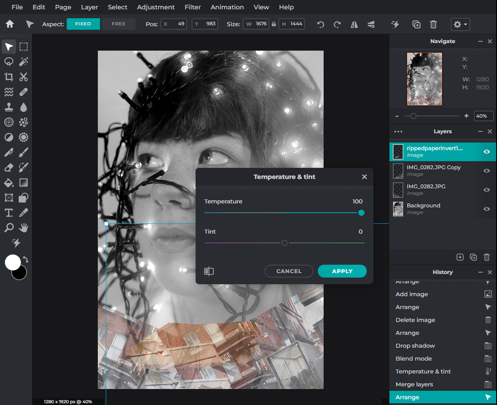
After that I used the merge tool so this paper would sit on top of my work I made earlier, this then allows me to move the paper around on top of the layer.
|
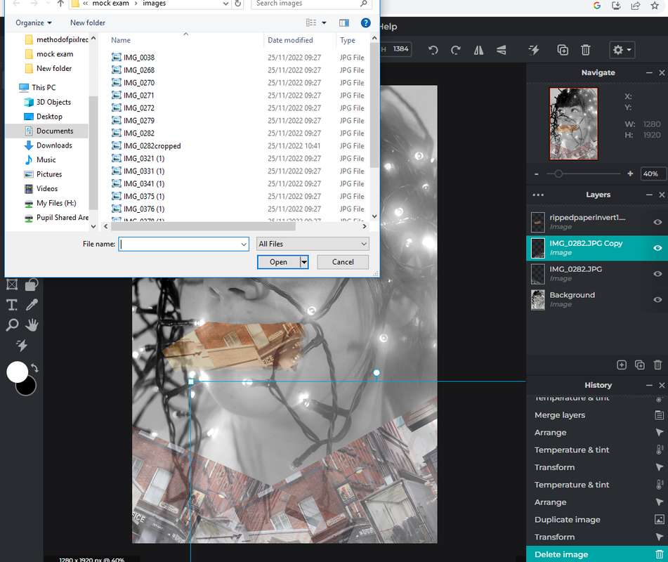
I then added the same image of the wagon and building again on top of this layer where I soon create the main double exposure of my image.
|
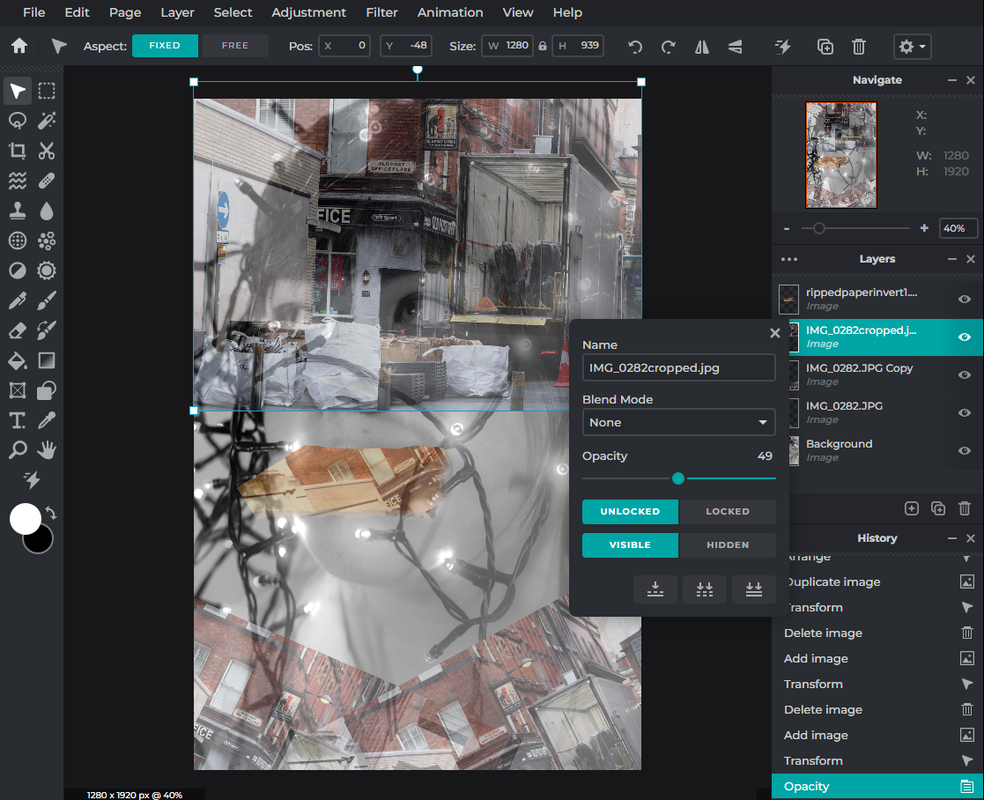
Turning down the opacity allows me to see through to my original layer, but I will soon return this later.
|
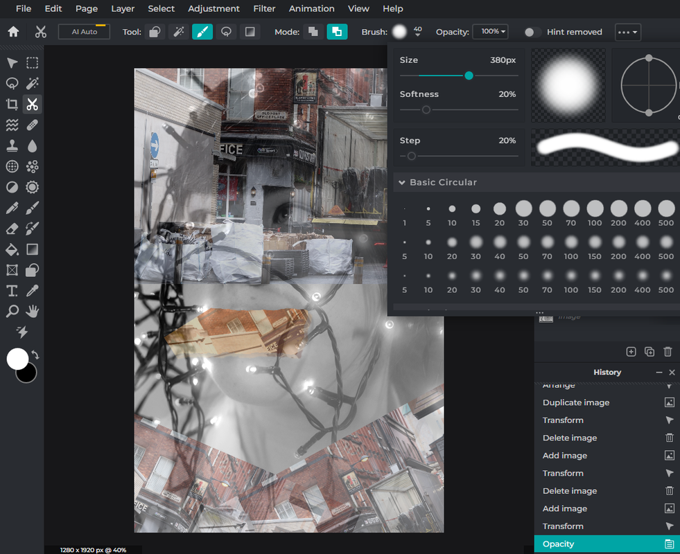
By using the cut out mask tool I can remove some parts of my image to reduce the sharp edges on my photograph and blend the two images together I then return the opacity.
|
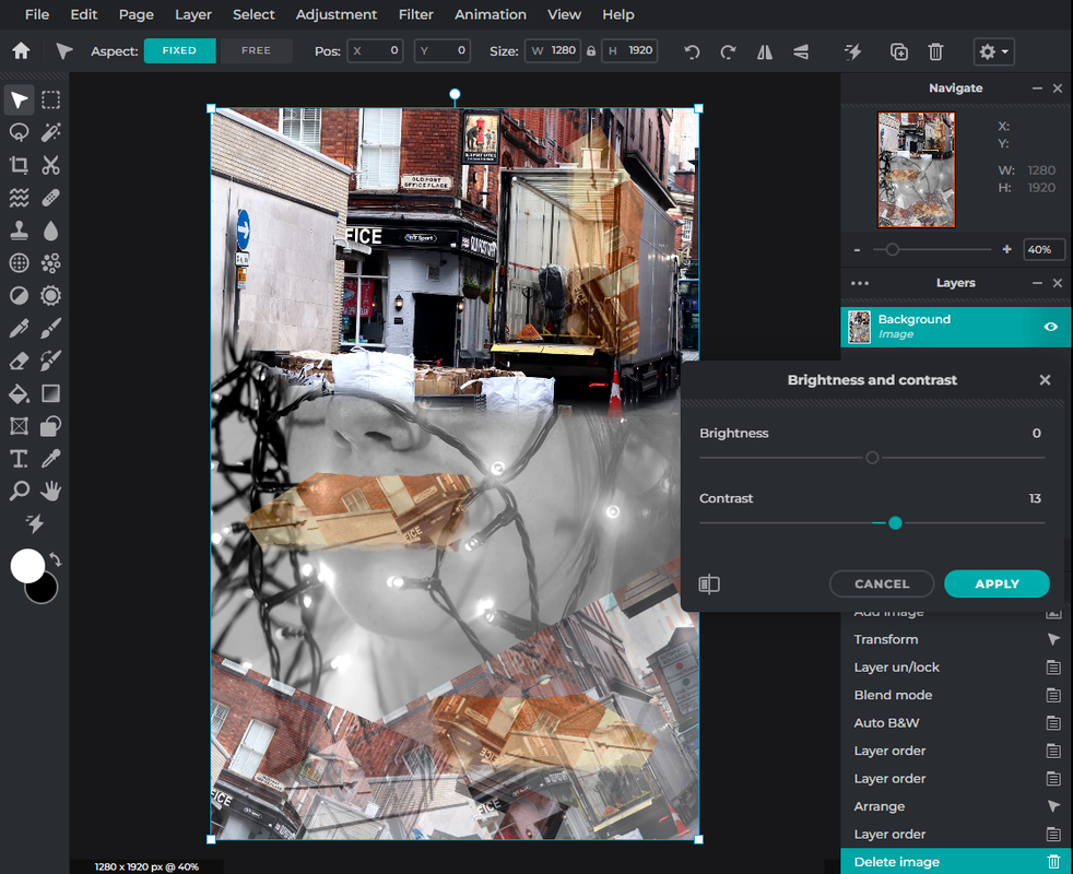
Here I am using the brightness and contrast tool to edit my final outcome and making the colours sharper and more visually pleasing.
|

Finally I changed the exposure and the curves to complete my editing of this image and placed it in monochrome as I think it compliments my work better.
|
4 Edited Images:

|

|
1. Here is my first edit, which I am partially happy with but there could be a lot of improvements. In my opinion I like how the building has built itself over each other at the bottom as this makes the viewer focus on this bit. I like how the model is surrounded by these buildings and that the flag compliments the colours. On the other hand I think this image needs more colour and could be more focused. This may be due to the contrast throughout the piece or that it is in monochrome. I also think that as the model's head is side on the double exposure isn't as effective but this was my first try. Overall I am pleased with this as my first go but I would like to improve this in the future.
2. This is my second edit which I am very proud of, I love the texture and the composition of the image. One of the strengths of this image is the bokeh. I think that as I have placed the building over this while making the opacity low allows this to shine. I also like the differentiation of the same building placed around the model, which adds variety and further texture. These images are inspired by Antonio Mora and I think I have emulated their work well but I have also taken it to another level of development. Furthermore, I took this bokeh effect around the image adding light to balance the photograph. This brought the photograph to life especially due to the random shapes created. Finally I also like the repetition of the eye throughout the image, through this portraiture project this has been my focal point and I enjoy that I have been able to include this in my work now. On the other hand I think I could have made the double exposure a more significant part of my image to create a better emulation although this is one of my favourite outcomes.
2. This is my second edit which I am very proud of, I love the texture and the composition of the image. One of the strengths of this image is the bokeh. I think that as I have placed the building over this while making the opacity low allows this to shine. I also like the differentiation of the same building placed around the model, which adds variety and further texture. These images are inspired by Antonio Mora and I think I have emulated their work well but I have also taken it to another level of development. Furthermore, I took this bokeh effect around the image adding light to balance the photograph. This brought the photograph to life especially due to the random shapes created. Finally I also like the repetition of the eye throughout the image, through this portraiture project this has been my focal point and I enjoy that I have been able to include this in my work now. On the other hand I think I could have made the double exposure a more significant part of my image to create a better emulation although this is one of my favourite outcomes.

|

|
3. This is my third image, I originally loved this one due to the central parting of the colours but as this is now in monochrome and has been used to create a rip effect this has become more eye catching as it pops out of the photograph. I additionally like the rips of the building I added which was to darken the photograph as it was originally mostly white and cream. I think this double exposure was extremely effective due to the rip of the model's eyes as it blends in better and makes you focus on this effect further. On the other hand I had to put the image in monochrome, this was disappointing as the tube lighting did not compliment the rest of the colours in that single image and as a result has turned extremely x-ray like and inverted but emphasises the texture and blends in with my work better. Overall I think that this was a successful outcome which I am very pleased with; I could see this being a poster.
4. This is my final outcome. I think this outcome is extremely effective due to the texture presented, this gives it an old fashioned look which is uncommon in portraiture today. By putting the portrait in monochrome I was able to use this architecture and the lights so this has turned out extremely well. I have also added lots of rotations and duplicates of the buildings at a low opacity which was very effective and confusing to look at. On the other hand I could improve this image by adding some colour to stand out and finish the image off. You can see a further analysis of this below.
4. This is my final outcome. I think this outcome is extremely effective due to the texture presented, this gives it an old fashioned look which is uncommon in portraiture today. By putting the portrait in monochrome I was able to use this architecture and the lights so this has turned out extremely well. I have also added lots of rotations and duplicates of the buildings at a low opacity which was very effective and confusing to look at. On the other hand I could improve this image by adding some colour to stand out and finish the image off. You can see a further analysis of this below.

Although on the other hand I think I could improve this edit by adding or building up further use of colour, but was unsure of what would compliment this sepia colour without ruining the edit. Overall I think this edit was really successful as it is striking to the eye and has a clear message and unique layout throughout the photograph.
|
I chose this image as my final chosen outcome due to the meaning, texture and repetition used. Although this isn't just two images, I love how I have duplicated layers, added ripped paper and edited this image further.
Due to the presence of a lorry collecting rubbish I decided to base this image around the environment and protecting it. I have expanded this idea further by placing the ripped paper over the model's face, acting like tape, to imply she has no voice in what has happened and there are no excuses. 
I decided to add this particular image to this edit to add an old fashioned tone to the photograph, which was successful, especially as this is named 'Old Post Office'. I think this was also successful due to the composition of the model being surrounded by this building and a chaotic atmosphere is created by this. I also like how the imaged is now in monochrome as it compliments the texture and rest of my work, enhances the mood and the fairy lights add an effective atmosphere to compliment the old fashioned buildings.
|
Editing Processes:
-I then went further to create rotations of my work shown below.
-I then went further to create rotations of my work shown below.

Firstly I changed the page size, choosing the width first which I doubled.
|

I then used the flip tool in the top right which is highlighted to flip the image to the rotation matches up.
|

Next I doubled the height and using the set page size tool under the page icon.
|

Finally I did the same thing by duplicating and then rotating my image to get this final outcome.
|
Final rotated outcomes:

|
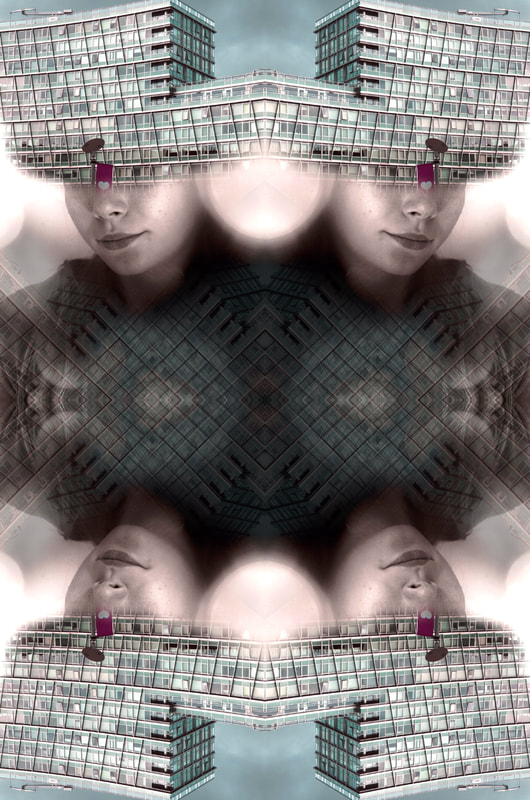
|
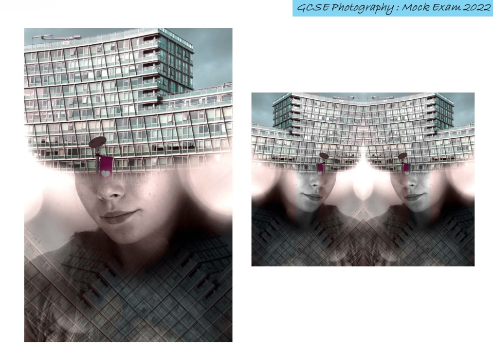

|

|
Improved Edits and The Process

|

|
Here I reintroduced my original bokeh image over the top and I used the blend tool to add an overlay. I then went through these options to chose the 'darken' tool so your are able to see some of the model's face over the top of my double exposure building. I then changed the temperature and tint to link the two photographs together by changing the portrait to monochrome. Although this has darkened the image the mood has developed and the face is able to be seen more realistically. This has additionally enhanced the fairy lights to make them more vibrant without overexposing the face too much, therefore this has been a successful photograph to develop further using PIXLR. I have also used this tool again to add words from a book to add texture and a rustic atmosphere.
|
|
Here I have developed this photograph by adding an overlay of a book, this adds depth to the image and removes the simplicity from this particular image. I have arranged them so I have twisted the buildings to add leading lines and a noticeable pattern throughout this photograph. To do this I did what I did similarly to before by adding a blend mode and changing this to darken to gently blend this into the background so it belongs in the image. I think this contrasts well to the slightly overexposed bokeh lights due to the image being in monochrome so also makes this photograph easier to look at and adds a nice texture to the photograph overall, this also contrasts to the square windows which are the focal point of my image.
|
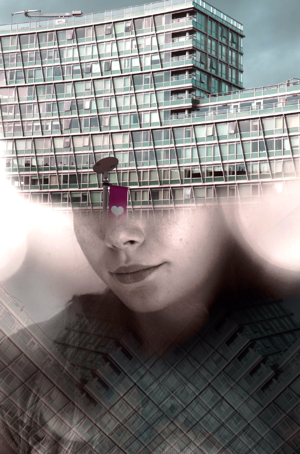
|
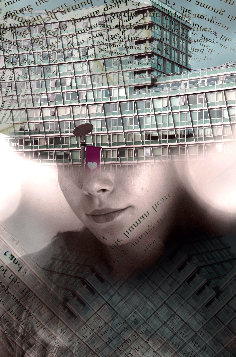
|

|

|
To further edit this image I decided to continue with the theme of adding the same book overlay to the photograph to introduce some connections and similarities throughout my work. In my opinion this reduced the exposure, neatens the top of the image and made the background unique and decorative. I also decided to place this cut out of the eye on the right of the image to make it different to the one in the centre as, since the beginning, this has been my focal point of this photograph. Additionally I have changed the 'Temperature and Tint' of the central eye using the adjustments tool to reintroduce the brightness from the initial shoot with the bokeh lights, this also makes the image balanced. Overall this has improved the image significantly.
|

I have also developed this image by adding words to connect them together, although this has been a repetitive theme throughout this photograph. I think this has added texture to the image but on the other hand the sharp edges could be changed to remove these visible lines from the photograph. |

|

|
EVALUATION
Throughout the 'Portraiture and Identity, Conceal and Reveal' project I have been able to develop many skills I have not yet been able to encounter and develop during this course. These consist of multi exposure, using a heat press, bokeh photography and much more. By doing this I have been able to evaluate the identity of my images and 'Conceal and Reveal' some aspects to improve my original photographs.
Portraiture and Identity, Conceal and Reveal has been an extremely broad project to discuss and create final outcomes for. There have been so many artists to research and emulate and many skills to learn and develop to use in my work later in life. Linking to my mind map from the beginning of this project I have been able to establish emotions, personality, decisions and genres through photography which has made my work even more successful and individual.
|
I started this project by researching the artist Lindsay Adler who experiments with colour gels to create a dramatic, or juxtaposing, relaxing atmosphere throughout her work by adapting the angle of lights, colours and body language. This inspired me greatly to emulate her use of light and portraiture, adding another level to her work. To research Adler's work I used her 'Editorial Beauty' project on her website to gain further inspiration and ideas that stood out to me. From her work I was able to gain an experience in the elements of lighting, colour, balance and shape throughout my photography to introduce colour gels and their affect on my work. We were soon able to go into further detail of colour gels when we had a workshop on this aspect of photography, to deepen our knowledge in portraiture and the many things you can do with this. To emulate her work we placed a backdrop and placed RGB lights at different angles of the setup to project complimenting colours on the model's face. We additionally used a shutter release cable to prevent unintentional motion blur. This then linked into motion blur where we took this as an opportunity to develop this technique of colour gels. We used the technique of motion blur by moving then models head in different directions, moving their hands to create different shapes and patterns by intentionally moving the body. To do this we used the camera settings of f/8 with a slow shutter speed and a tripod so this intentional movement is not impacted. Their work helped me to understand the theme of portraiture and identity by discovering the range of techniques that lie under this one subject of colour gels and how you can use this as a starting point to build other themes and outcomes from this one process. Here is a quote I find inspiring linked to our work in this section of the project.
|
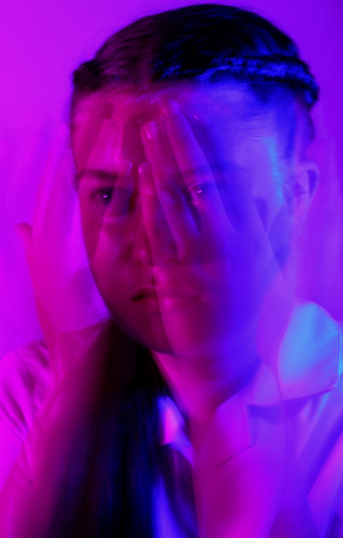
|
'Photography is my greatest passion in life. As an educator I believe that we should never stop learning and that is especially important for photographers to continue to grow, push the boundaries and learn new techniques.' - Lindsay Adler
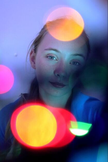
|
Furthermore, I was soon inspired by the work of Brandon Woelfel due to how appealing and exciting his work is to research and look at. Due to the technique being bokeh, the use of light is a significant part of the photograph where you can introduce many different colours, shapes, textures and quantities of light to an image. This takes more details of light and expands them to make it the subject of the image, creating an unusual effect on the model in the case of portraiture. As mentioned before from this artist I have been inspired to emulate his work due to the use of light and the emotions this creates by adapting small things. To emulate his work I took part in two shoots, one in school time and one I took home where I photographed my friend. At school we used fairy lights on a tripod and a white back drop to prevent and distractions from the subject and the bokeh lights. To actually carry out this technique we placed the lights initially in front of the camera lens so they would focus automatically, soon moving this focus away to pay attention to the model creating an impression of an overlay. For the shoot at home I took the same process but this time with a blue coloured light in the background to match the model's eyes and clothing. We used the corner of a room in this shoot so therefore inevitably had no backdrop behind, but even with the lack of equipment this turned out to be my best shoot and the focal point of my digital and physical editing compositions. Overall Brandon Woelfel's work was a great way to experiment further into photography and has been one of my favourite techniques to study.
|
He introduces emotions and juxtaposing atmospheres throughout all of his work and unlike other photographers this is interpreted through the lights and not the model themselves which I find very inspirational. Below is the quote from his work which I think sums up the importance photography and even with limitations you can be successful.
“If you’re gonna judge someone’s gear before you even see their photos, the door is right here.”
— Brandon Woelfel
|
Another photographer I researched was Alma Haser, who takes normal and plain portraiture images and develops them using physical editing and origami to add 3D shapes on top of her work. This inspired me due to the unusual interpretation of her work she creates and furthers by adding these paper folds. Through her work it is apparent that she uses the elements of texture, space and form to build up her paper which create all of these elements. I have also taken these elements as a starting point to emulate her work and find the key aspects to certainly include which was successful by using neutral colours and evaluating my folds to make my work individual. I then went further to digitally edit these outcomes by adding bright primary colours to the key features of my face like the eyes. In this section above you can see videos of this process and how to replicate her work. Overall this links nicely to out Portraiture and Identity project as the ideas of conceal and reveal to cover up facial features with these paper origamis. This photographer stood out to me as it related to the quotes I initially mentioned at the beginning this is shown below.
'We reveal our joys and successes, we conceal our pain.' -Jesse Jackson |

|

|
Based on the recent project we based off our Liverpool shoot and our best images from the idea as a whole. I began looking for photographers who used the double exposure to adapt their portraiture work. In this process I found the photographs Antonio Mora and Matt Wisniewski, which together was my main inspiration for my outcomes. Through their work I discovered the elements of shape, colour and double exposure. As much as I followed their techniques I added my own twist to this work by adding a ripped effect to the final outcomes and some words from a book to add texture and detail to my work. To digitally edit this I used PIXLR to add in an image and add this on top of my initial work. To reach my final outcomes I continued to build up the edits on top to create an overall photograph. You can see this method I used above inside my mock work. This links well to my project of portraiture and identity due to the interpretation of the models created. Combining architecture and portraits was not something I would initially associate with this project. Overall this was an extremely successful way to combine my work together and create a final outcome from not just my Liverpool shoot but the course as a whole.
|
|
In my opinion one of my most successful outcomes is the double exposure photography I created during the November Mocks, not just as it is visually pleasing, but there are many technical aspects which make this image so successful. Firstly, while editing the original image I considered the compositional element of this piece. I used the crop tool to ensure the rule of thirds was used throughout my process and the framing from the words, and duplicated buildings surrounding the image were placed precisely so there were no huge distractions from the main focal point of the photograph. I additionally had to consider the colours already used in the image. Due to the presence of pink and blue being prominent it would be obvious select a building that complimented and made this feature of the photograph stand out. I chose this building as it toned down the image and added an architectural atmosphere, it also contrasts the clean and magical use of bokeh photography with the worn down blue architecture. I made sure the eye level viewpoint was maintained throughout the digital process like the original image so there was a consistency. Once I had created my double exposure technique on the editing software PIXLR I was able to enhance the photographic features included, for example, brightness & contrast and exposure. The use of a simple subject in my image allows the rest of the photograph to have a strong texture with many layers of images. As this focal point is a simple sign with no additional complicated details added, I am able to make my subject matter stand out and be central to all the additions around this point. Before creating this image I researched the bokeh photographer Brandon Woelfel discussed earlier and my double exposure photographers Matt Wisniewski and Antonio Mora. Although my Mock outcomes went on a slight tangent to their work, my outcome was backed with strong evidence and my own interpretation of the photograph.
|
Overall, in my opinion, all of these things lead to a successful outcome to be proud of. The development of the original image has taken many turns to produce other outcomes not just this one, therefore the development is key to keep improving and expanding the initial aims and meanings behind the photograph.
|
|
In some images I then went further to visually see the original photograph in my work to illustrate the journey through one piece. Here is the outcome which I am extremely proud of, which in my opinion displays all the elements of photography.
|
One of my photo shoots I carried out I learned from greatly by the successes and fails it took to complete my final outcome. While creating my sculpture from one of my initial bokeh photographs I discovered the fabric material I used was too stiff to create the look I wanted. I soon photographed this in a dark light with fairy lights. In conclusion all of these things led to this outcome being unsuccessful. Due to this I went further to produce one of my unique and most developed outcomes I have created not just in this project but throughout my website in general. To do this I placed my sculpture over a colour changing light. From the previous shoot I discovered not all colours complimented this outcome so I sustained a single colour this time. I additionally used unique viewpoints to photograph my work adding to my creativity with compositions which I hope to further in the future. While photographing my work I focused on the 3D parts of my sculpture which stood out the the viewer. |


|
Although this project has created many successes I have many techniques I can improve on, for example, lighting and increasing creativity. I have developed many final edits to add detail, more colours and a depth of creativity, but I could originally do this by adapting the composition and viewpoints of my photographs. Portraiture photography is an ideal topic to discover these new techniques through composition, which is a shame I couldn't carry this out. If I had an opportunity to do this in the future I would definitely consider experimenting with this process. Some of my strengths throughout this project are the digital editing skills and enhancing contact sheets. When looking through this section of my website it is evident that I have improved my editing skills and displayed how I have carried these out to create my final outcomes. By annotating my contact sheets to a significant extent I have been able to make it clear how to improve many of my images and how to finalise them. Towards the end of this project I have been able to experiment more independently and go off on my own tangent which I have very much enjoyed. Due to this, while emulating artists work I have added a twist to their work based on my own preferences and inspiration; I look forward to displaying this in my exam soon.
|

To physically edit my work I have experimented with many techniques, leading me to have the opinion this was one of my strengths too by combining many of these processes together, for example, sewing, layering, sublimating, drawing and laminating. Overall I think this project has been very triumphant as it is clear my skills have significantly improved and how I have displayed these have become more clear and thorough.
|
Further Physical Editing / Miriam Bohm

|
Miriam Bohm is an artist that uses sculptures throughout her work which mostly includes nature and she creates these by using carboard, mountboard, paper and scissors. In my opinion she is a great artist to emulate due to the simplicity of presenting her work but how effective it is. When I am emulating her work I plan to use the images shown above created from my original bokeh photography, sculpture and then illuminous images. I think this will work very well as it is a developed way to present my work and adds to the effect of shapes. I additionally plan to use Miriam Bohm's work as a starting point and inspiration for my outcome as I plan to use circles and squares to display my recent edits. This then ties all my work of bokeh photograph together and creates one final outcome with elements of everything I have created throughout this project.
|
Sublimation Printing Process: This technique is a way of transferring my images to the borders presented in the image above as a way to emulate Miriam Bohm's work. Sublimation printing is the technique of using heat to essentially bring the fabric/material and ink together to create one final print on a material. A design is initially printed onto some sublimation paper. The inks used in this turns into gas when heat is applied and then combine the ink onto the material you are working with. In this case this will be the borders and I will use a heat press to so this process.
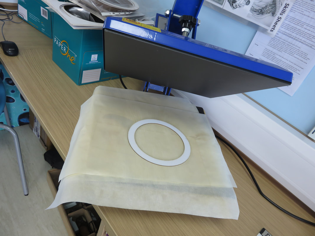
|
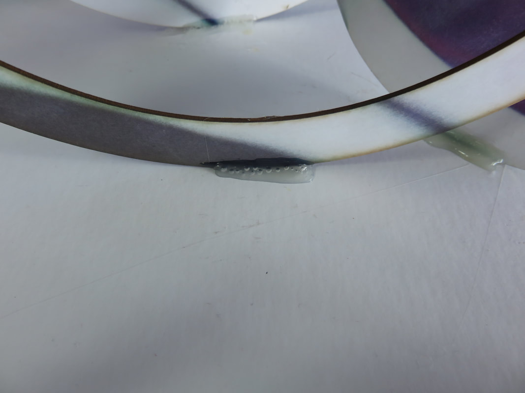
|
Firstly I sublimated my work with the chosen shapes after I had printed off my work on sublimation paper like you can see. After I placed this inside the heat press I shut the machine and it sublimated my work onto the shapes I chose. I soon then temporarily stuck them onto the white base I created with mountboard and once I was happy used a glue gun to properly secure them to the base. I additionally had a mountboard background of a rotation of one of my images to complete my sculpture. Overall I am very happy with my outcomes as they emulate the artist very well and bring my project to a close. Below you can find the photographs I took of this sculpture with different coloured lights like I did with my previous outcome to finalise my work.


